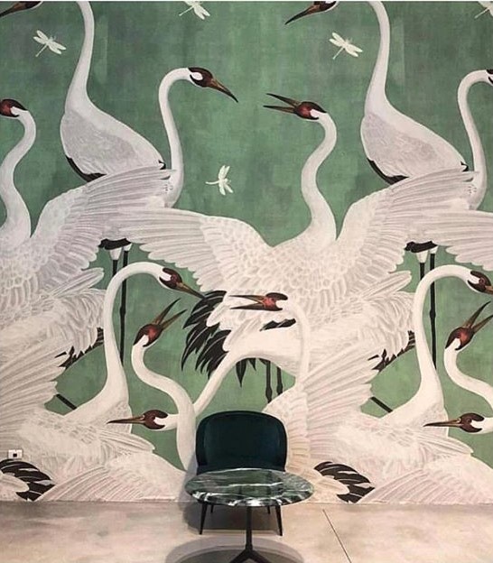
Out of all aspects of decorating, work with color is probably the most important one. Thankfully, there is a lot to work with as tycoons of color industry never cease trying to outdo each other in coming up with new proposals. From four highly-renowned firms – Sherwin Williams, Behr, PPG and Dutch Paints – we’ve selected 5 colors that we know will be trending hard next year. We promise you won’t be able to pick just one favorite!
Blueprint
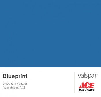
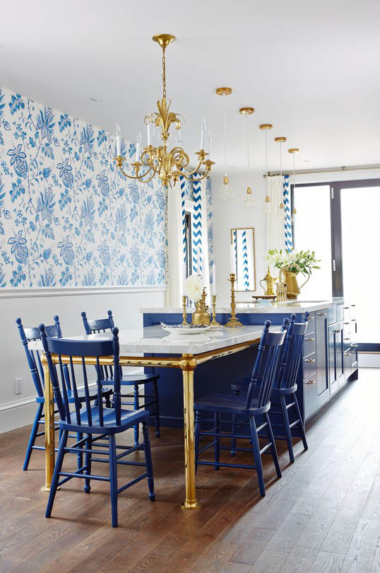
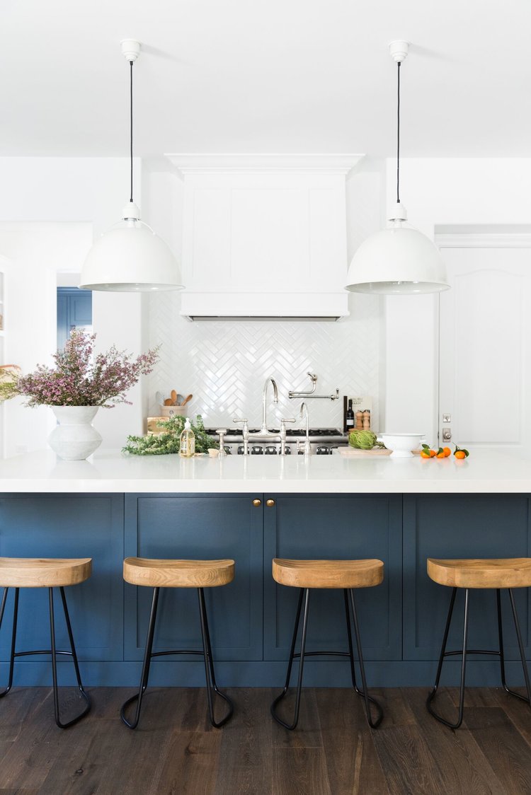
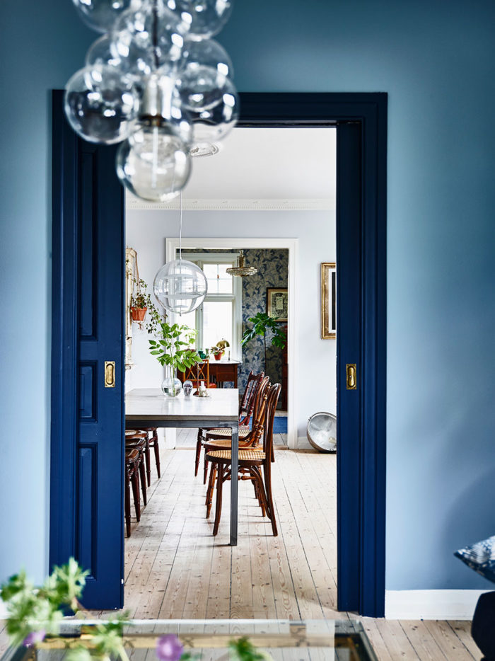
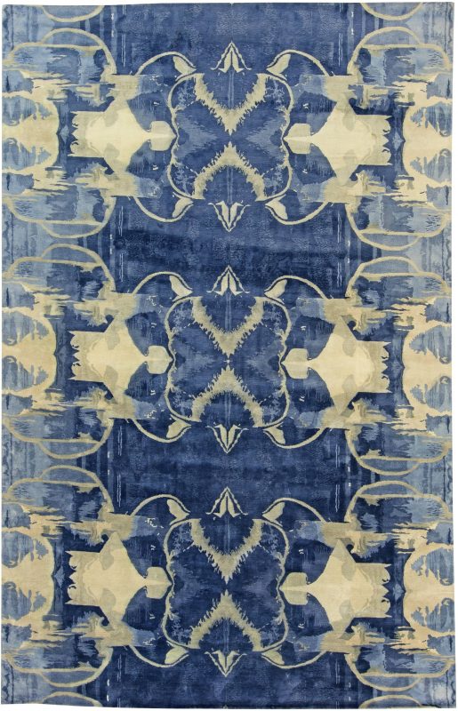
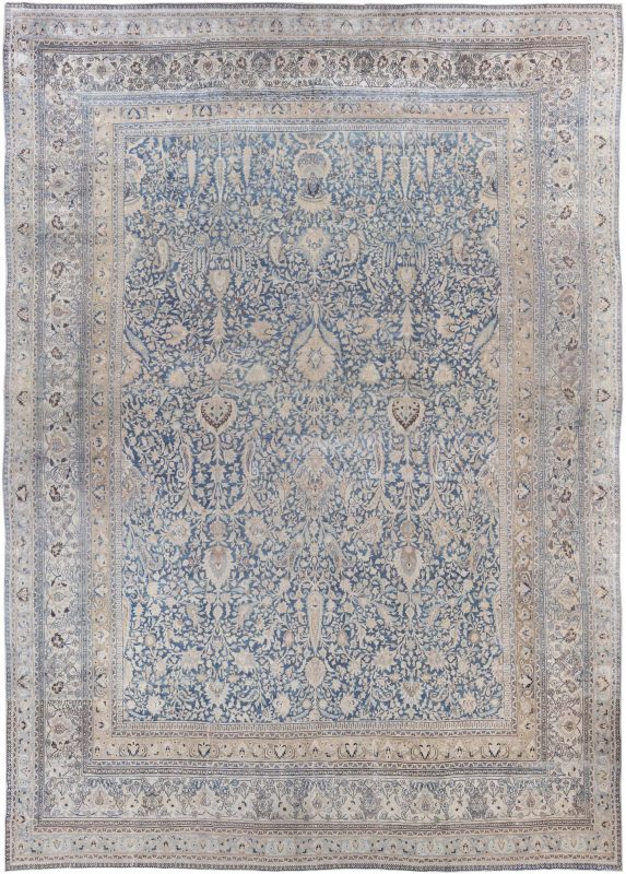
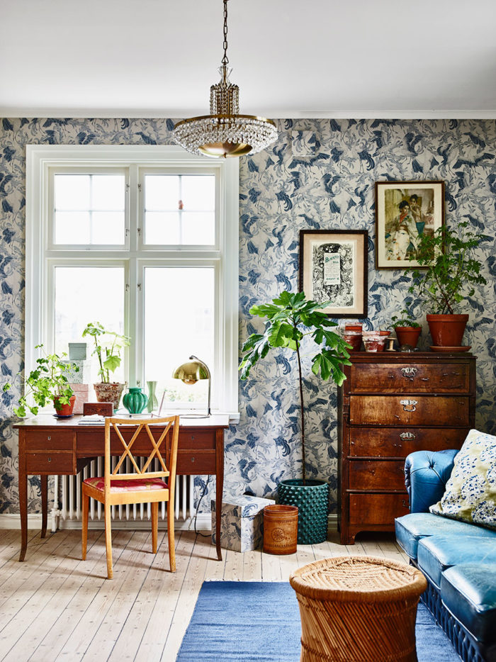
This year blue has re-entered the grand design arena with the introduction of Sherwin Williams’ Oceanside. The ‘big water-inspired’ color proved to be ideal for kitchen cabinets. Now, the competitive Behr company gives you Blueprint. In comparison to Oceanside, Behr’s proposal is milder and more universal. That makes it suitable for both partial and allover arrangement, in matte finish or high gloss alike. Try it out in your bedroom or even living room – it is soothing and thought-provoking at the same time!
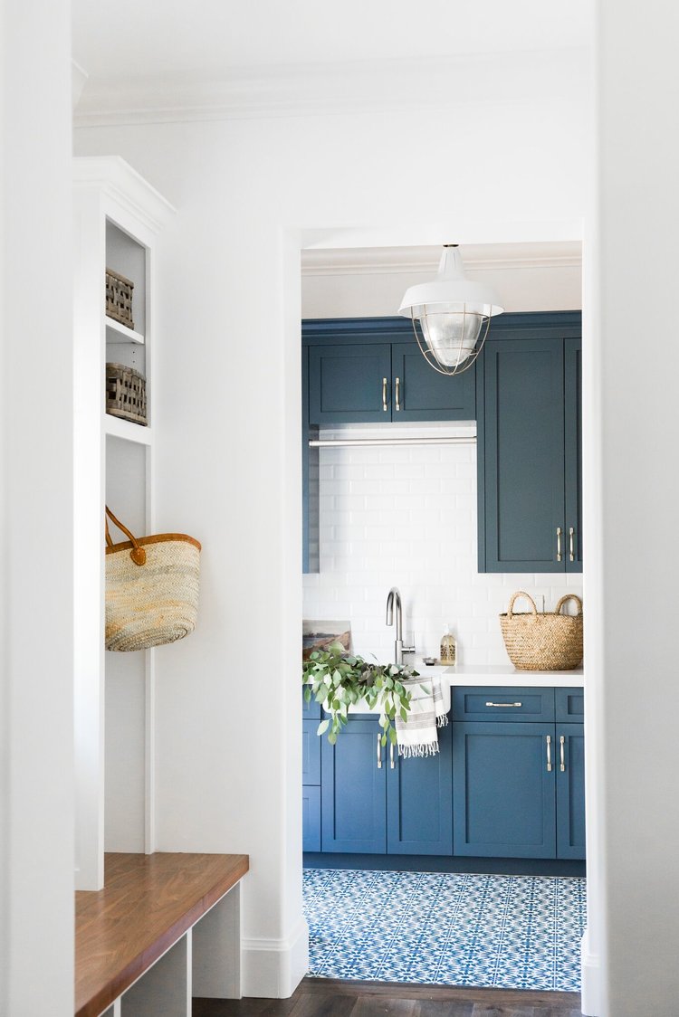
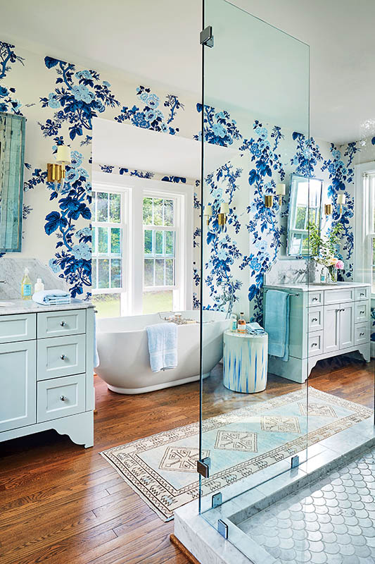
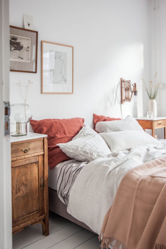
Cavern Clay
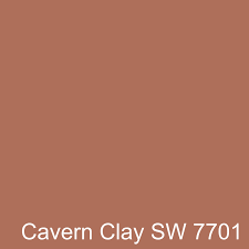
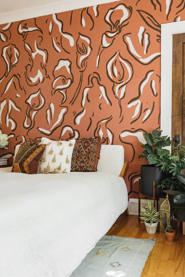
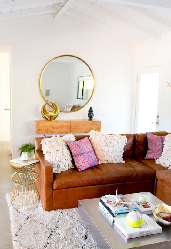
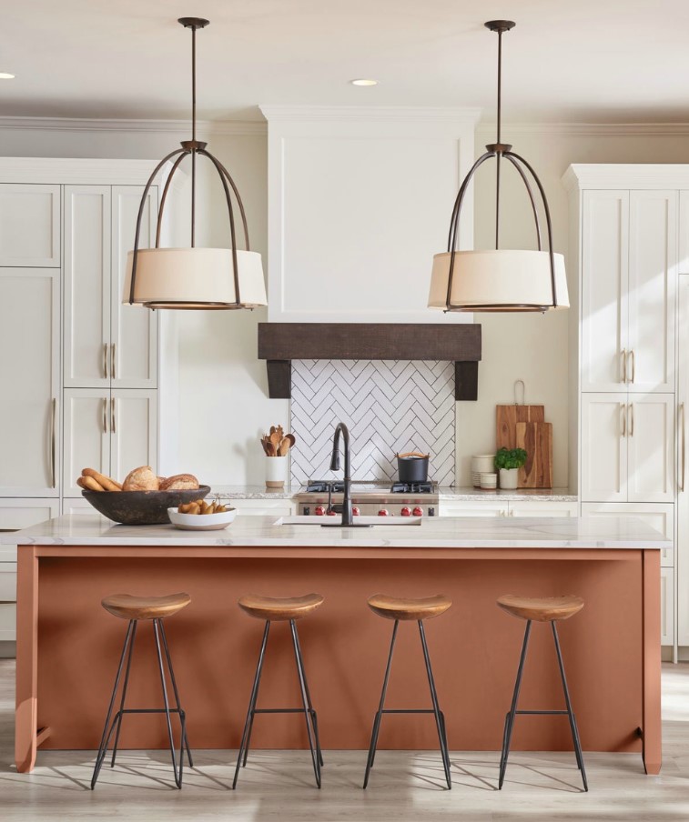
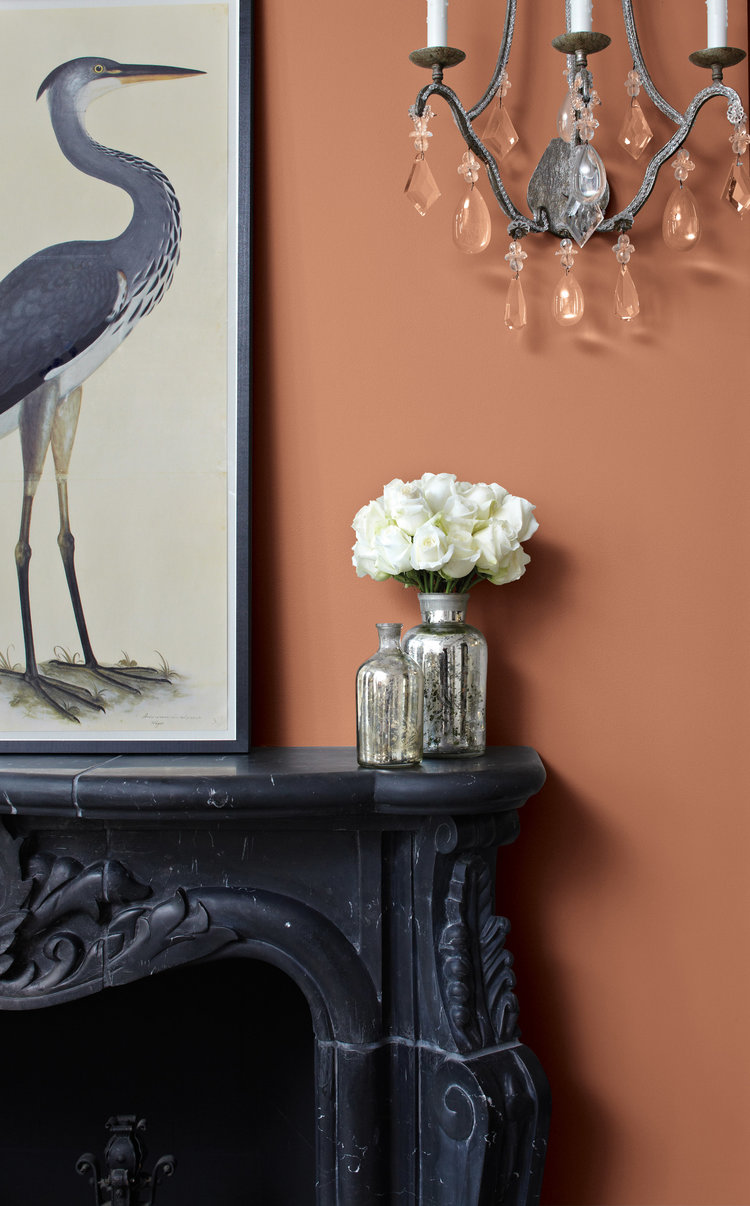
Most paint brands lean towards cool hues in their proposals for the next season. However, the before-mentioned Sherwin Williams decided to bet on something completely opposite. Cavern Clay is warm and elegant. The shade conjures up the distinct vibe of the 60s’ and 70s’, so if Mid-Century Modern is your preferable style, Cavern Clay will help you build up the atmosphere. Moreover, it is earthy and autumnal so Farmhouse interiors will also benefit from its presence!
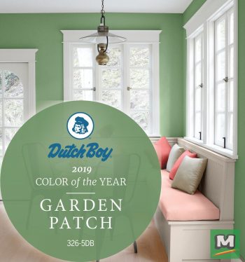
Garden Patch
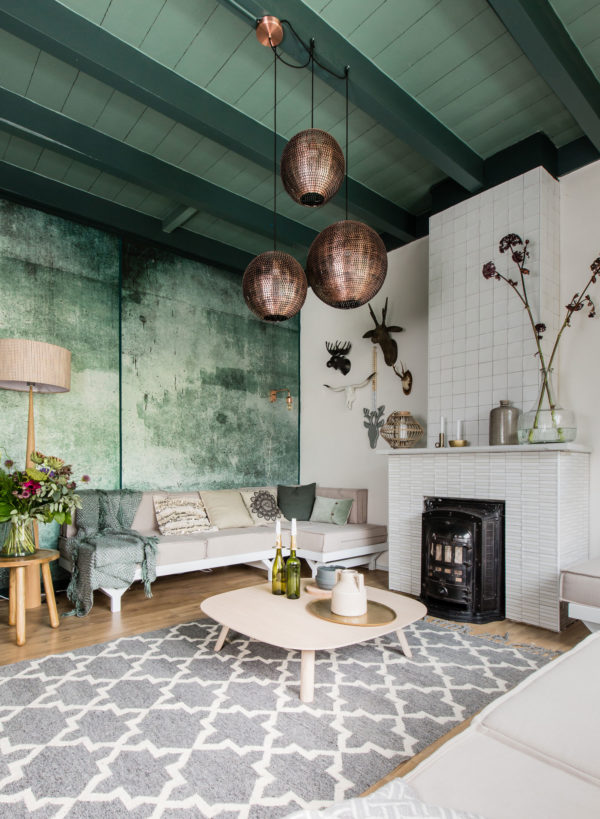
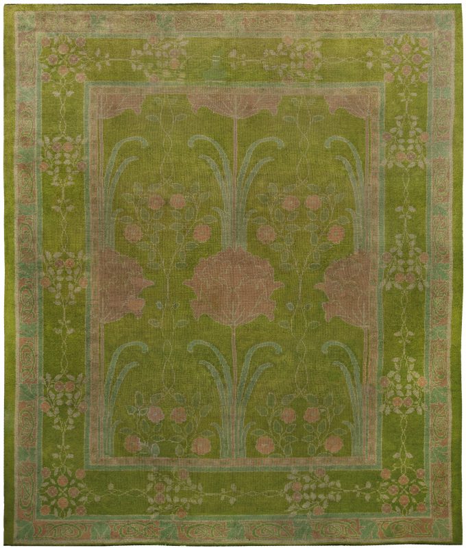
The three remaining colors are three greens that simply couldn’t be missed! Ever since Pantone announced Greenery the color of 2017, green has dominated the world of design. From potted plants through accessories to walls, different shades of the color have become omnipresent and the trend does not seem to be ending.
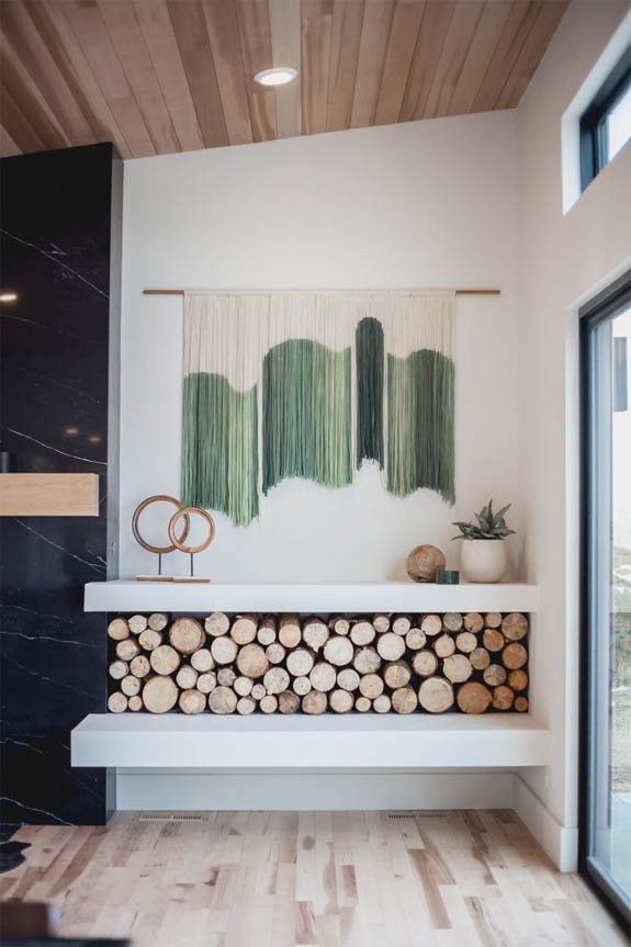
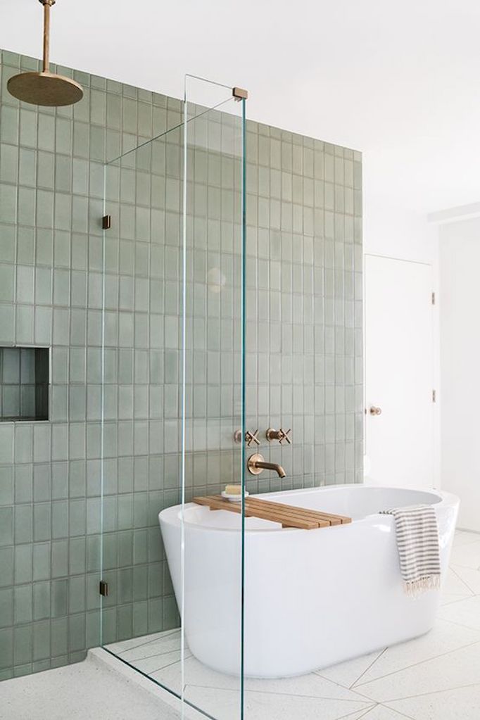
On the contrary, it is getting even bigger in presence. After Greenery, there came whitewashed Sage and saturated Hunter Green. Dutch Paints with their Garden Patch offers something in between, not too deep and not too primary. It will give your space a refreshing touch!
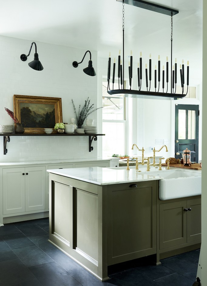
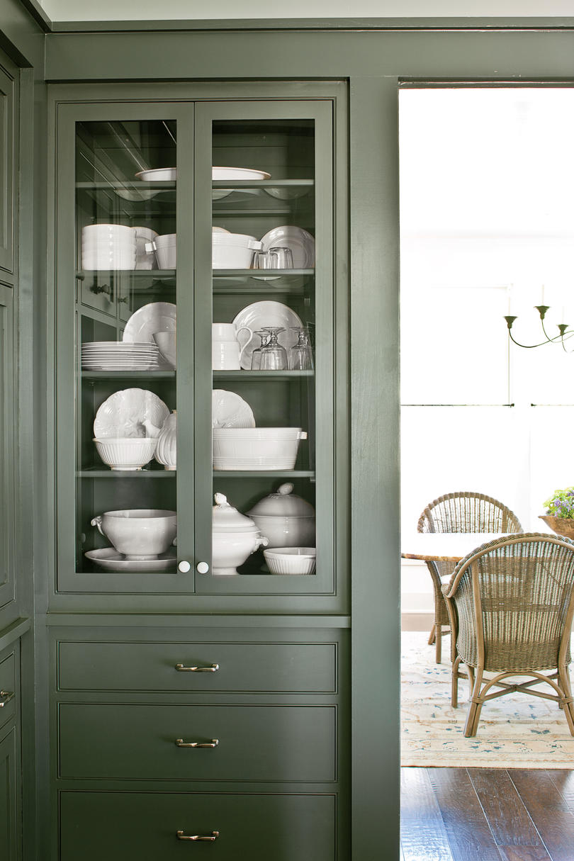
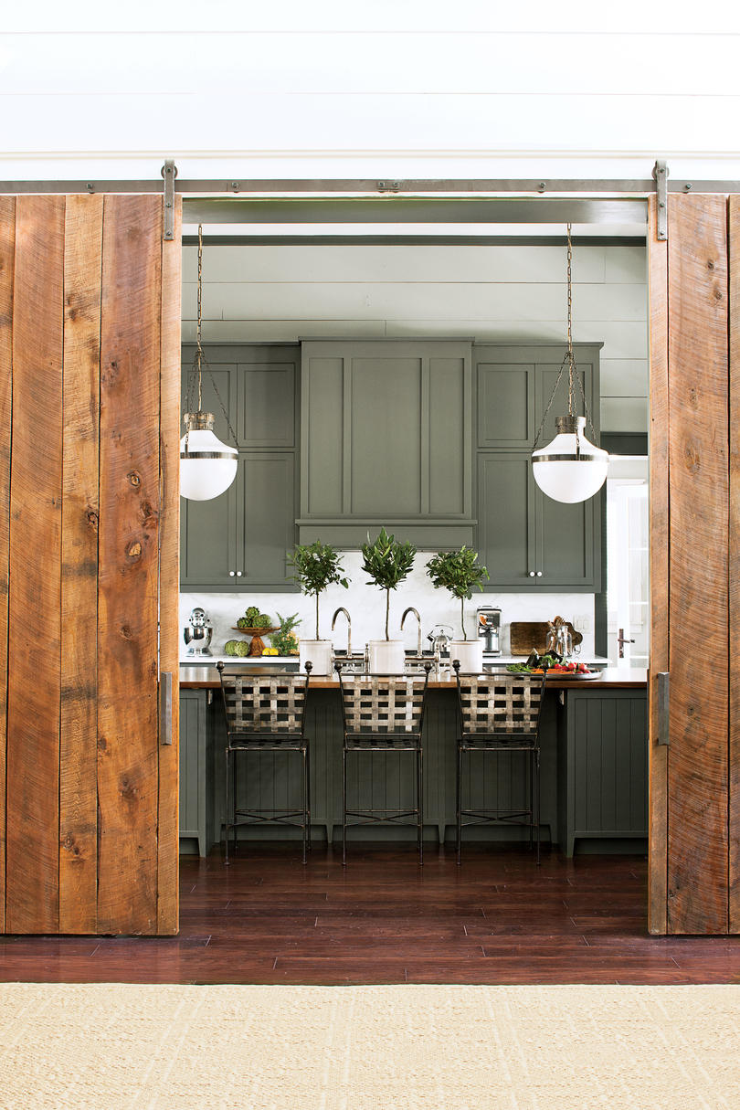
Pewter Green
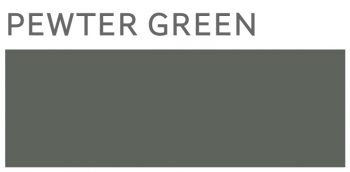
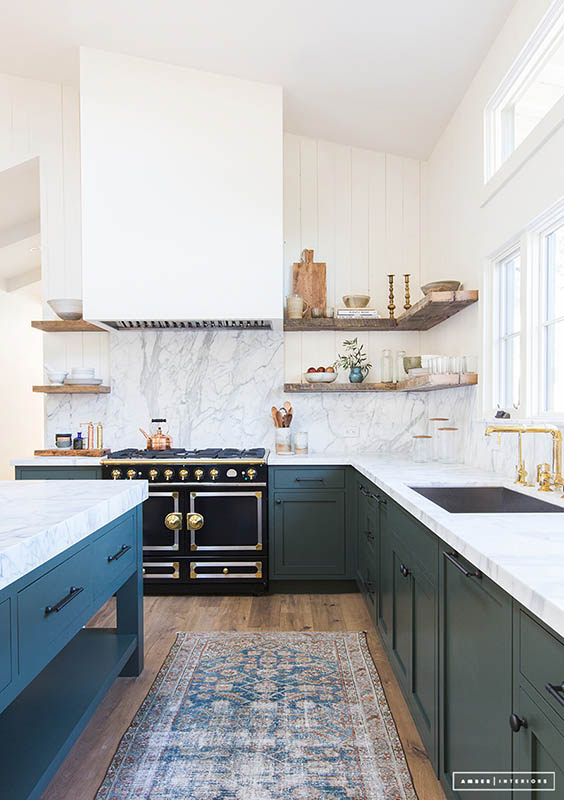
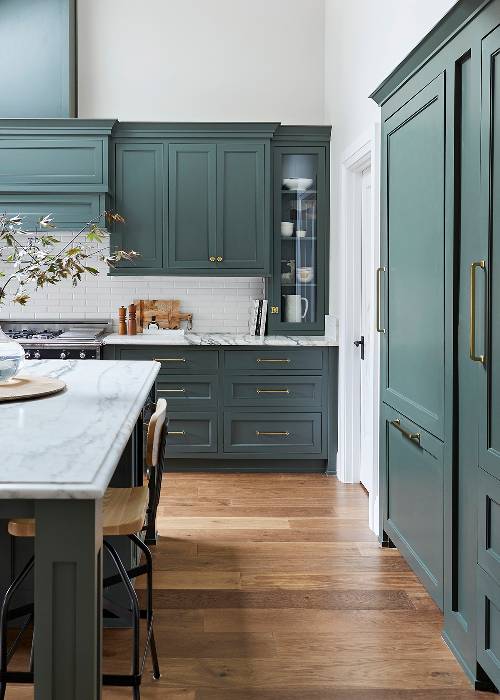
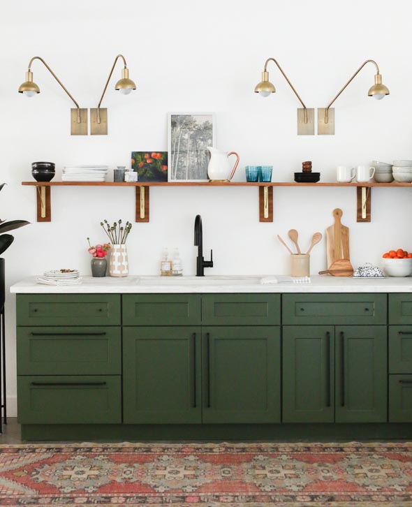
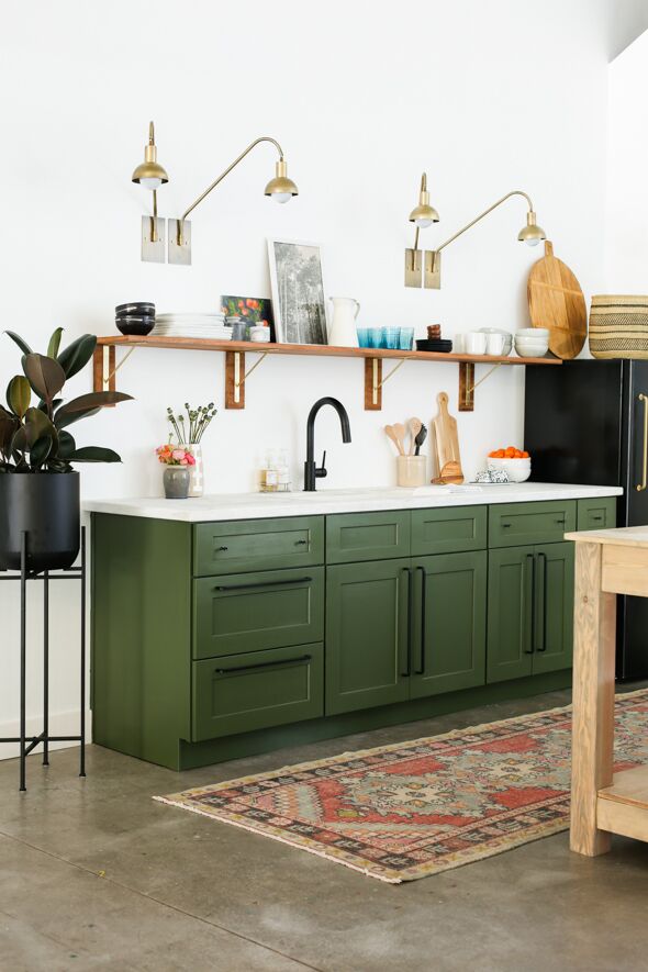
Another shade by Sherwin Williams – Pewter Green – is an intriguing fusion of blue and green with grayish undertones. Famous decorator Emily Henderson has already hailed it as the leading color for the 2019 kitchens. And it is hardly surprising – Pewter Green is definitely tasteful and delicate so it will not limit your further decorating choices. It is also a great alternative to whites and grays that are slowly coming out of vogue.
Night Watch
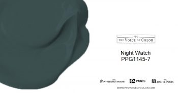
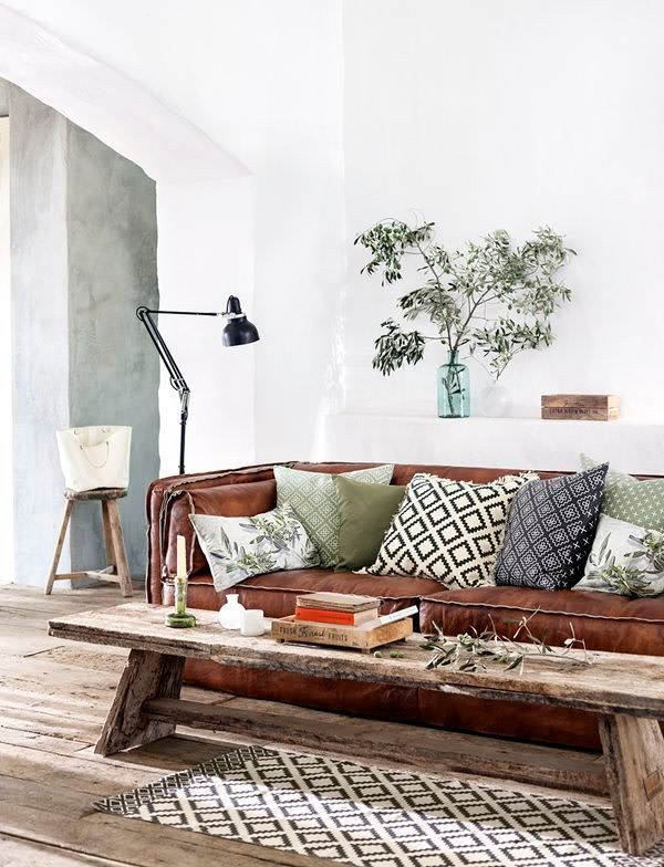
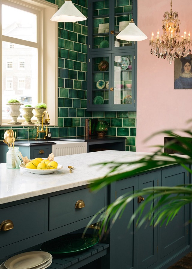
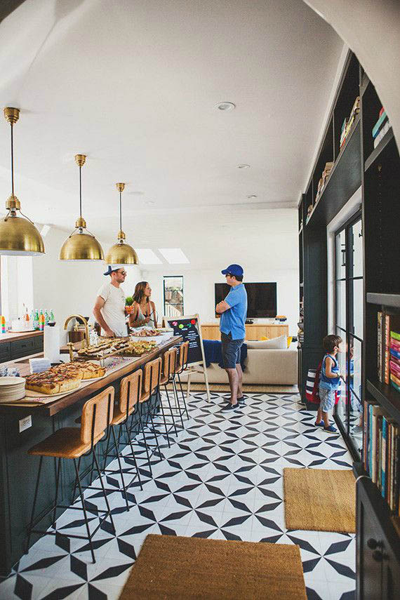
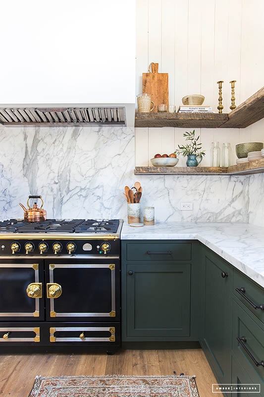
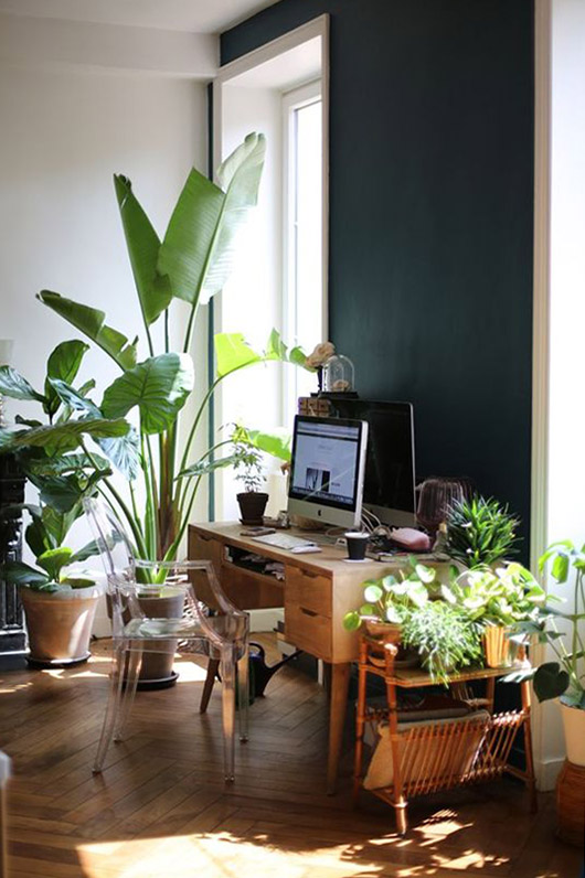
Last but not least is PPG’s Night Watch. Once again we are dealing with a shade of green but it’s nothing like the previous options! This time we are presented with a color that’s richer, darker and more saturated. Dee Schlotter, PPG senior color marketing manager, says that: “Night Watch is about bringing the healing power from the outdoors into your home through color. The dark green hue pulls our memories of natural environments to the surface to recreate the calming, invigorating euphoria we feel when in nature.”
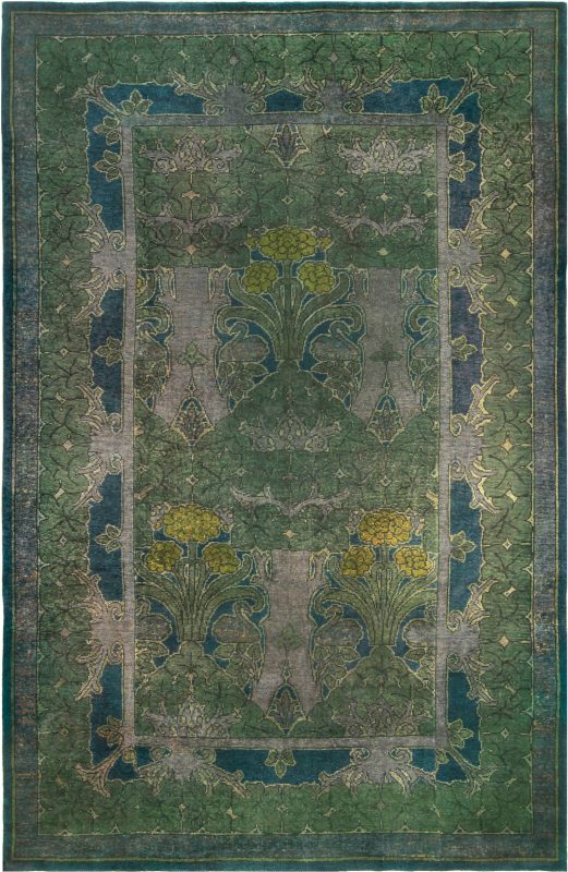
The strong character does not prevent Night Watch from being versatile! PPG sees many applications for it including front doors or office rooms. We Definitely picture it in the living room, in the company of gold and orange (like Cavern Clay!).
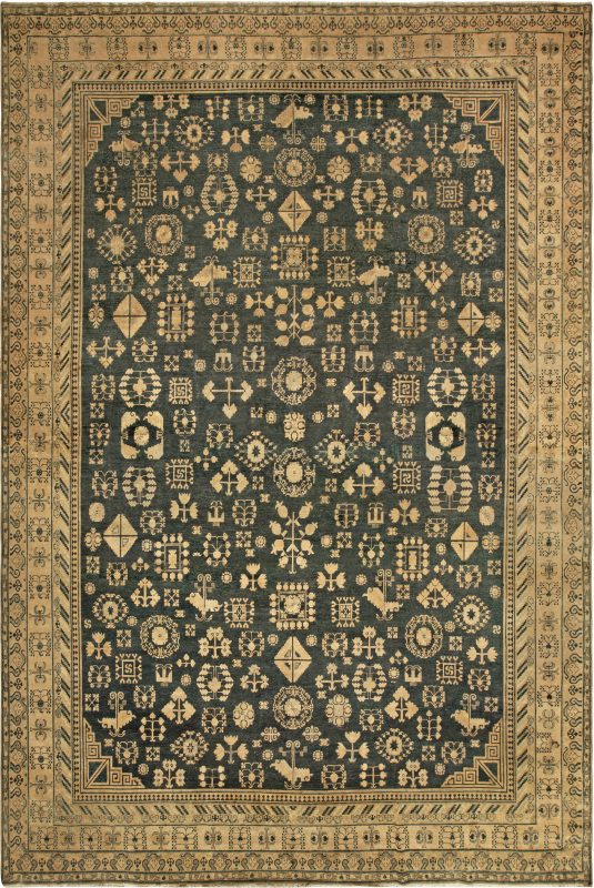
Doris Leslie Blau can help you find the right Persian carpet or oriental rug. We have a large showroom in New York City plus online catalogs and supplementary information. For help choosing a product for your needs, contact us online or call 212-586-5511.
