In design, color plays a vital role as a mood creator, and this year, we have learnt how important the right color palette in an interior is. Spending a lot of time indoors has brought out the hues that really positively influence our mood, and this seems to be the direction which paint producers and tastemakers are trying to take.
“This has been a year of unpredictability and 2020 has significantly changed our relationship with our home. When our color team began exploring a palette for the coming year, we knew it needed to be grounded in what we’ve been craving: comfort and personalization,” says Erika Woelfel, vice president of color at Behr. Meet 4 collections of shades, which, according to Behr, are going to bring us a sense of peace and comfort in 2021, and “elevate your comfort zone”.
Casual Comfort
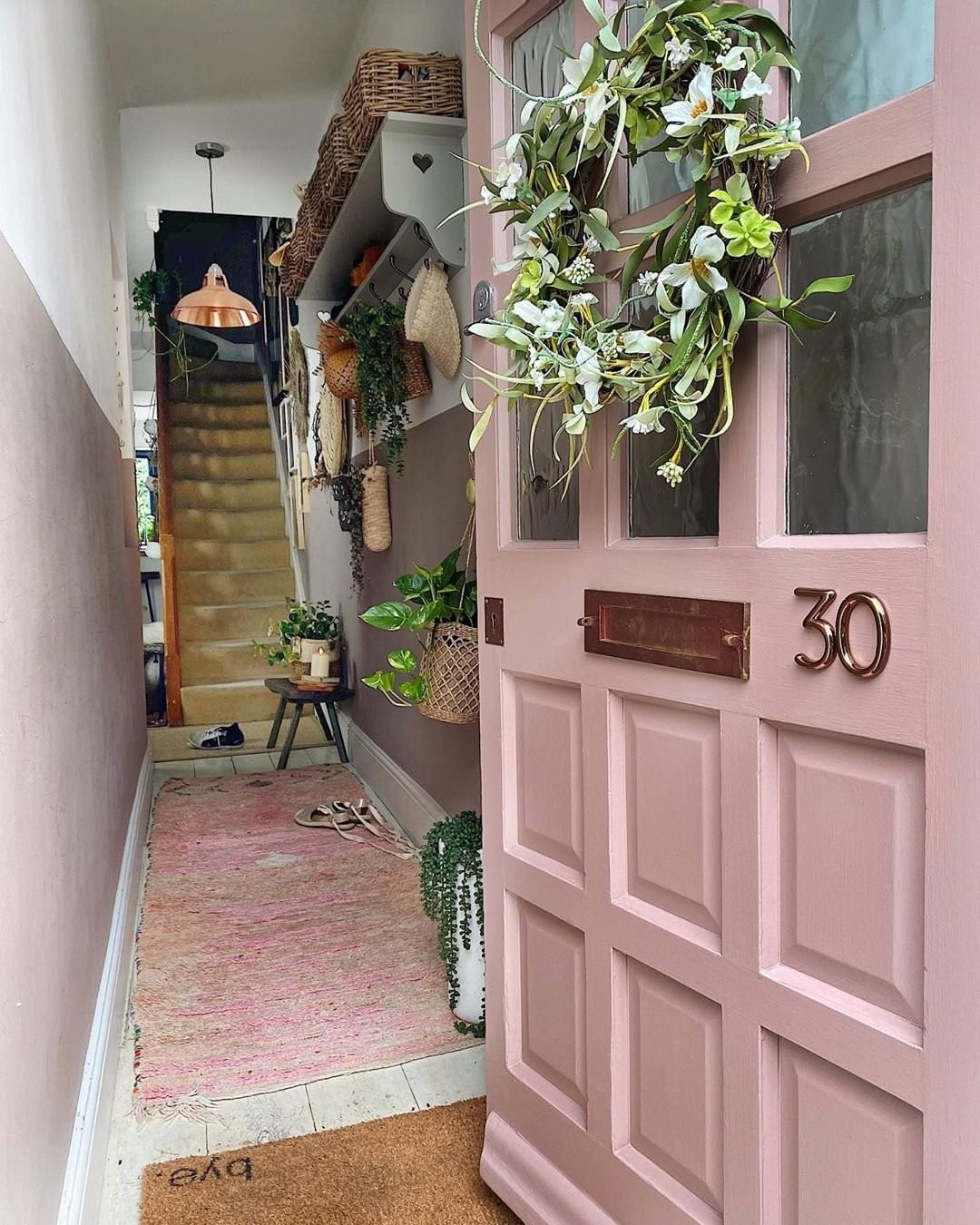
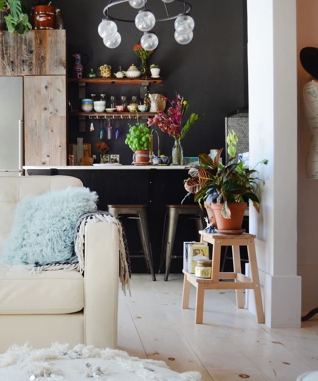
“Light warm neutrals and whites create an inviting feeling in entryways, kitchens and open living spaces,” according to Behr. A light pink or brown shade will make your interior more inviting and create a relaxing space for you and your family. It’s also a great background for décor ideas and will bring warmth to your home. In this collection of shades, “light and cozy neutrals offer an updated take on the casual farmhouse look, achievable with warm-toned hues,” according to the Behr team.
Subtle Focus
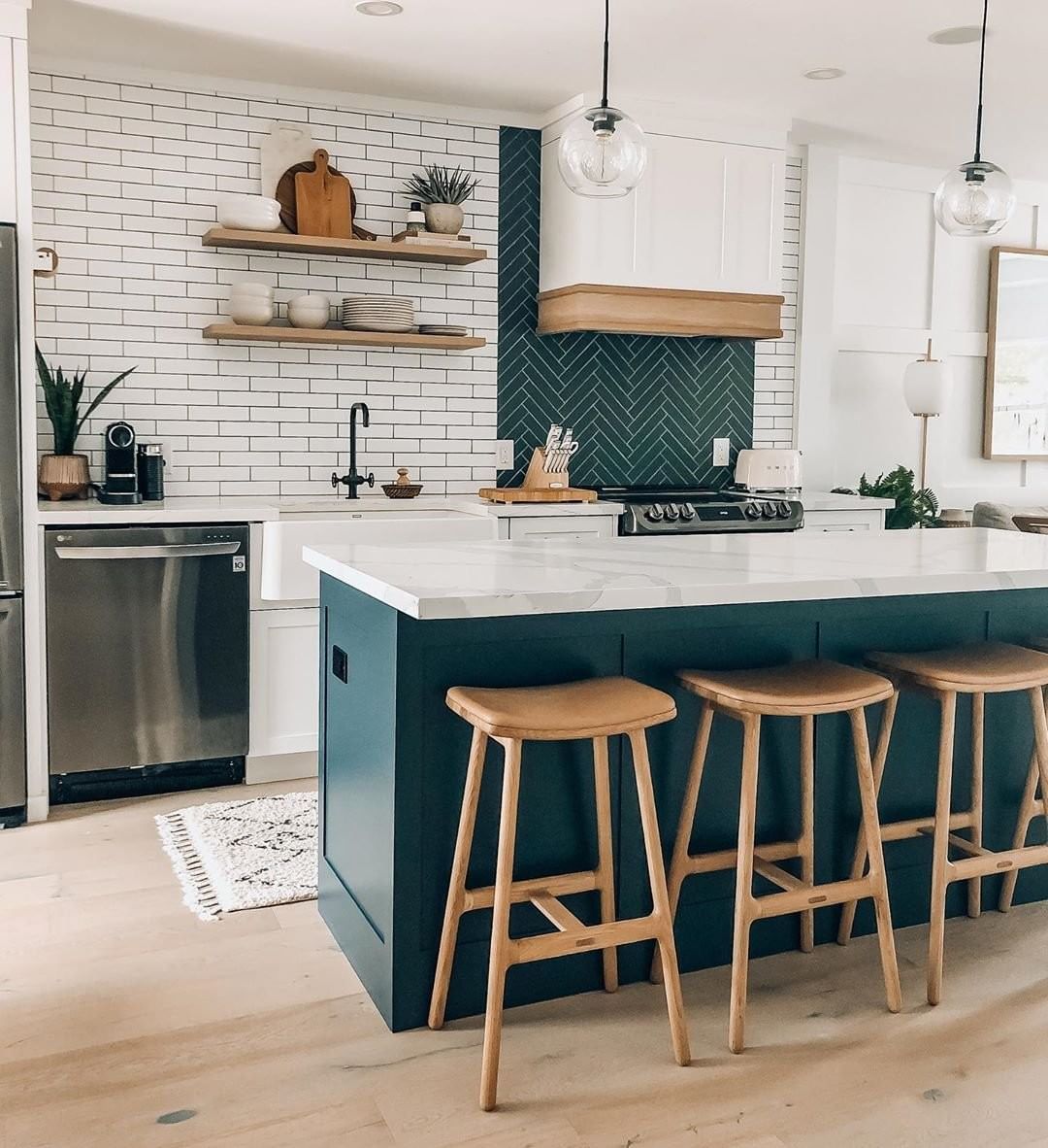
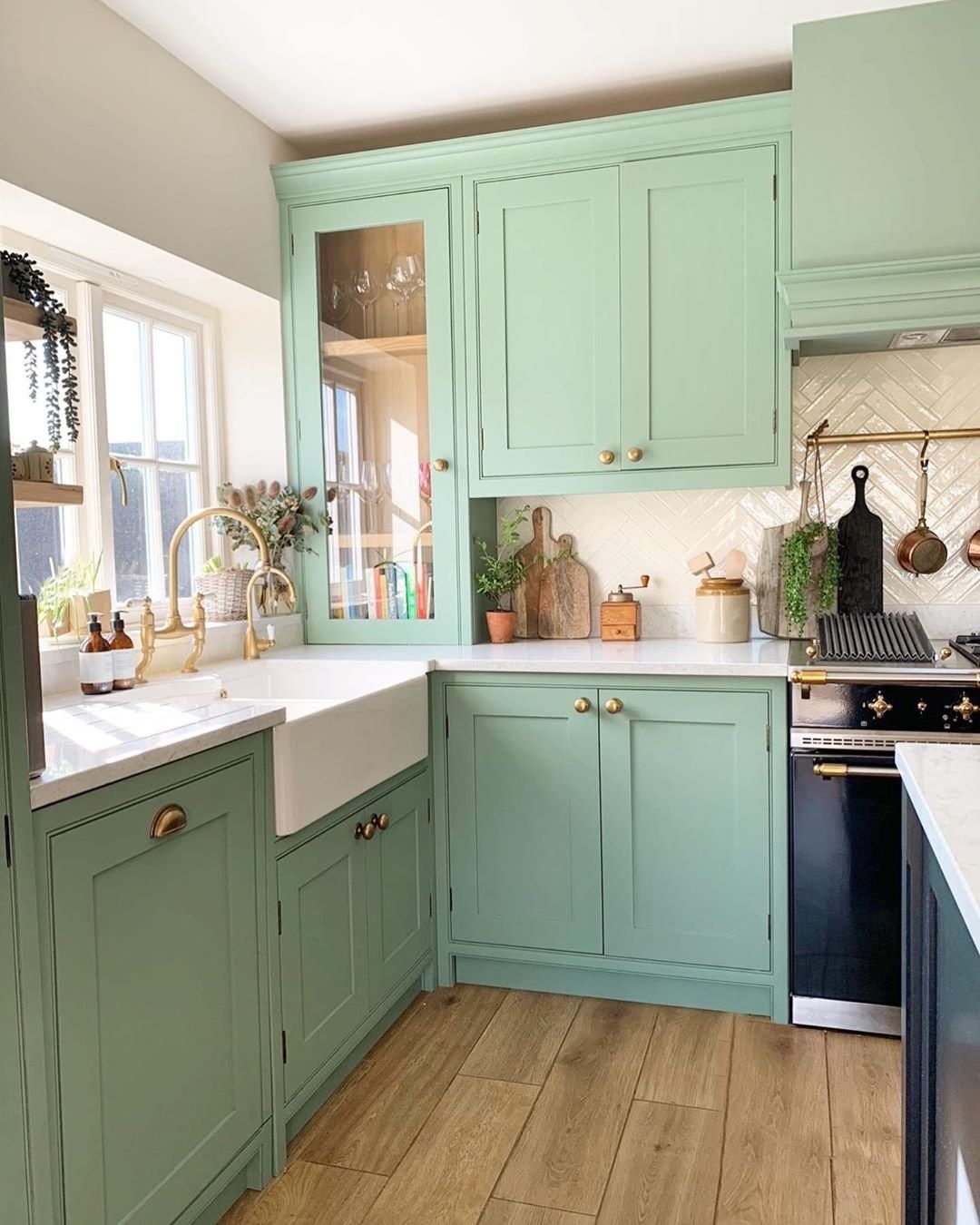
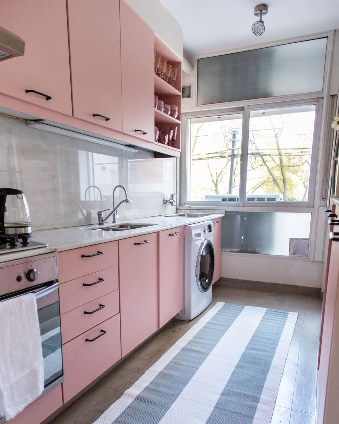
As you can read on Behr’s website, “Light hues feel sophisticated and inviting, creating an atmosphere that is effortlessly serene.” This palette will reflect the light of every season, truly bringing serenity to your home. Tinted pastels, in colors like Wishful Green or Cellini Gold, provide cheeky accents, giving you more room to play with your décor ideas. These softer shades, are “inspired by modern versions of Art Deco design and styling.”
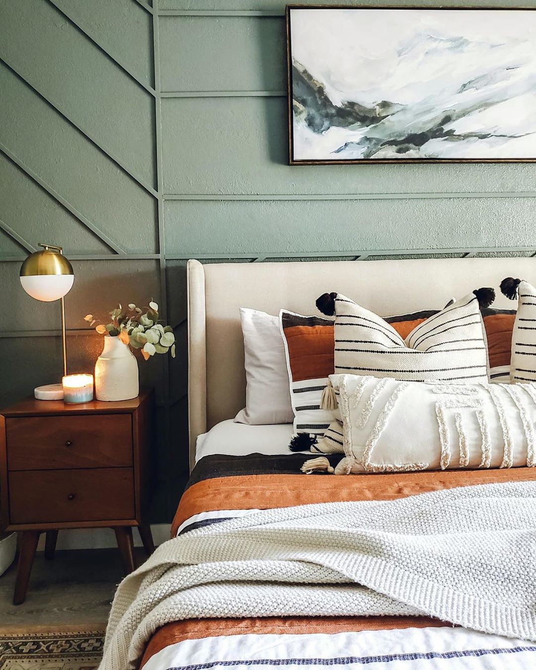
Calm Zone
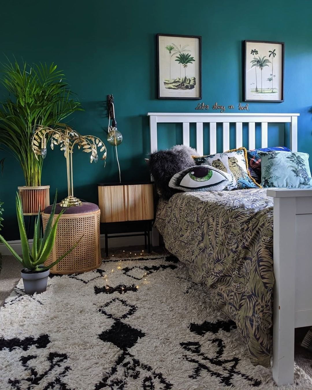
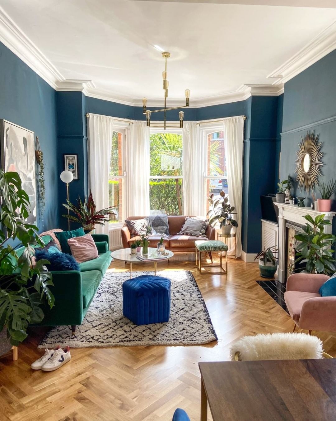
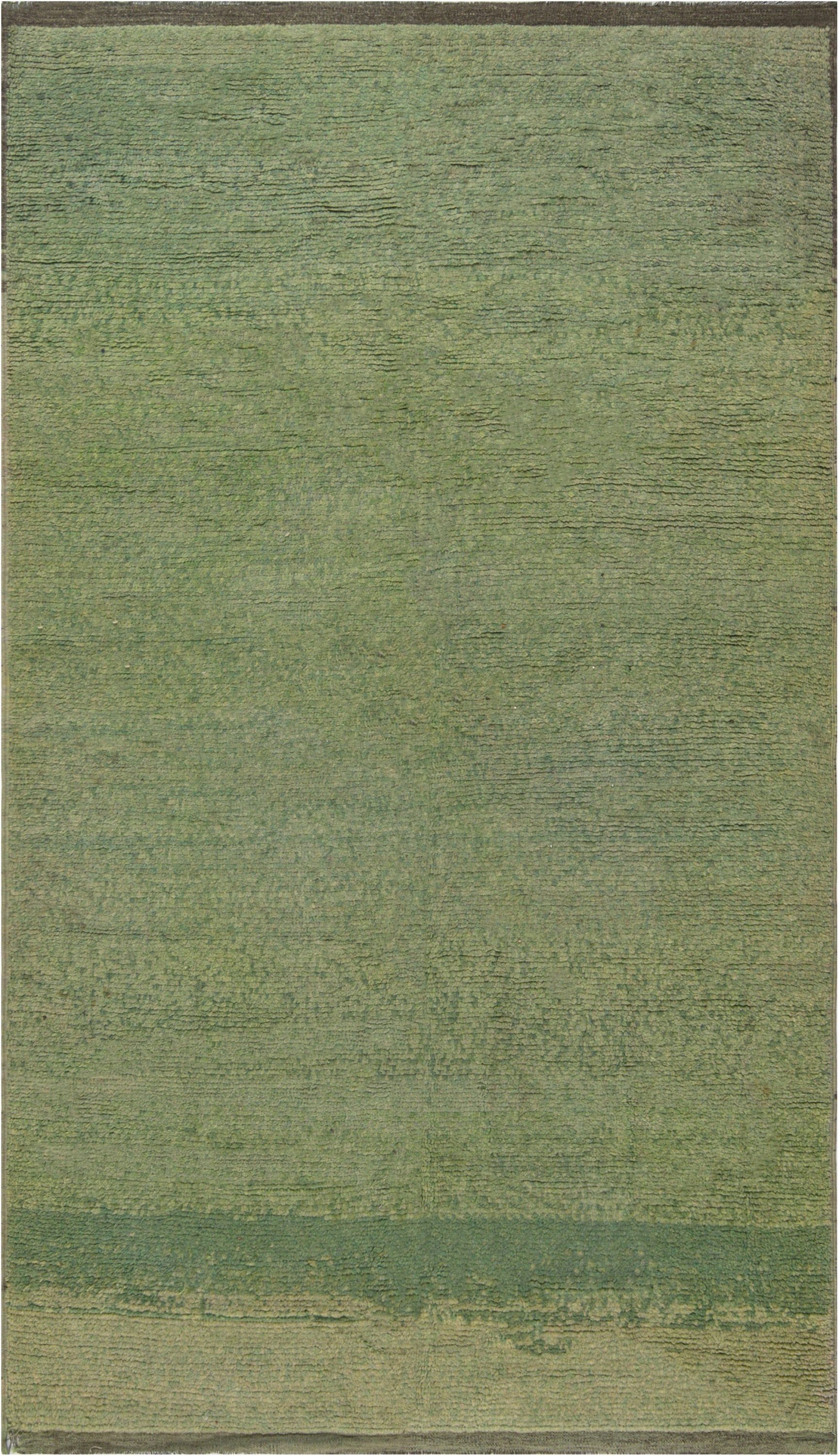
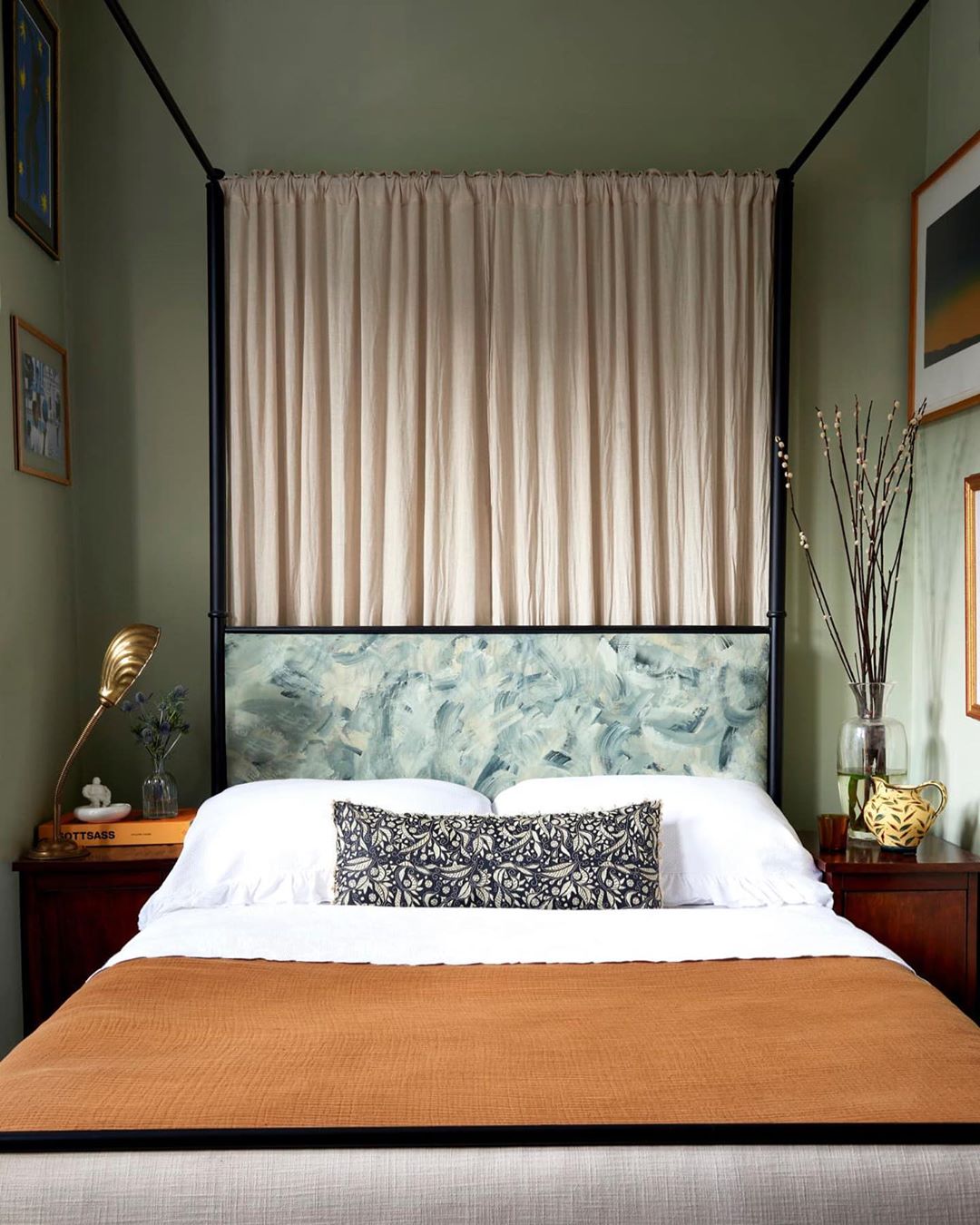
Experts at Behr describe the Calm Zone collection as “soothing blues and greens [that] create a restorative escape offering ease and solace.” If you need a space of absolute calm and focus, discover a range of hues, from Jojoba to Jean Jacket Blue, in this collection. It’s perfect for your home office or daylight reading room. While all the palettes are meant to make us feel great at home, the Calm Zone is a reflection of “our society’s desire for self-care and wellbeing.”
Quiet Haven
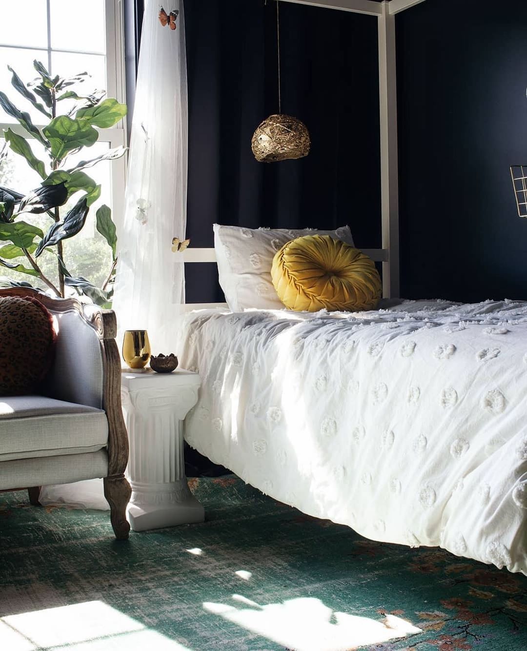
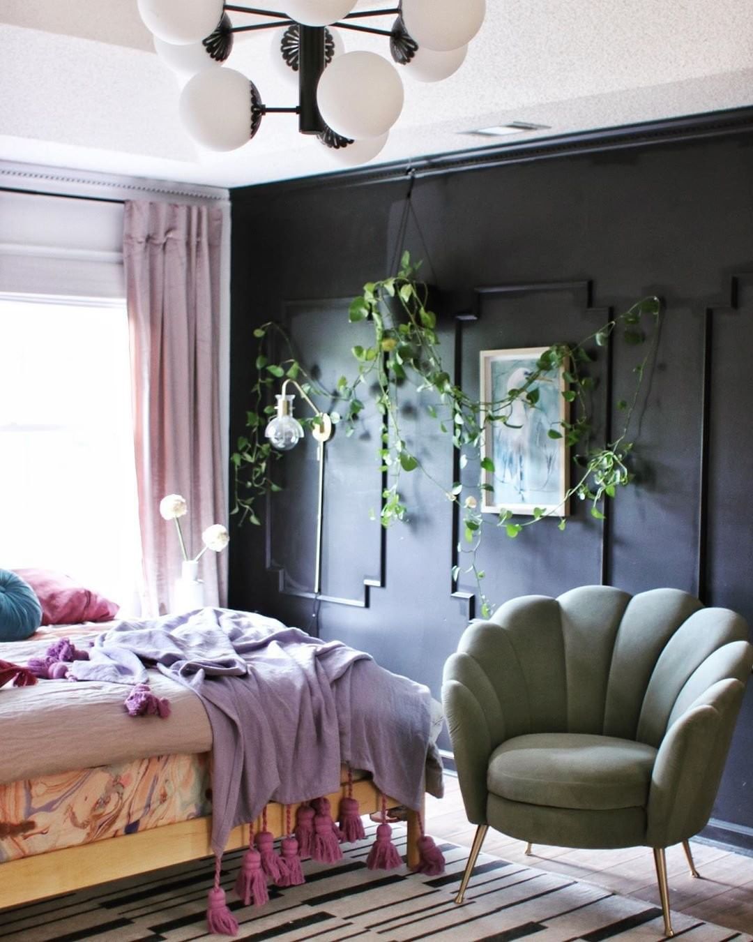
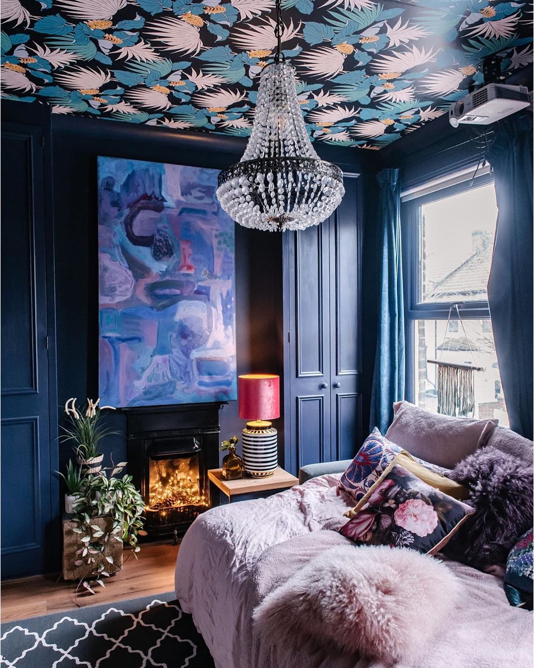
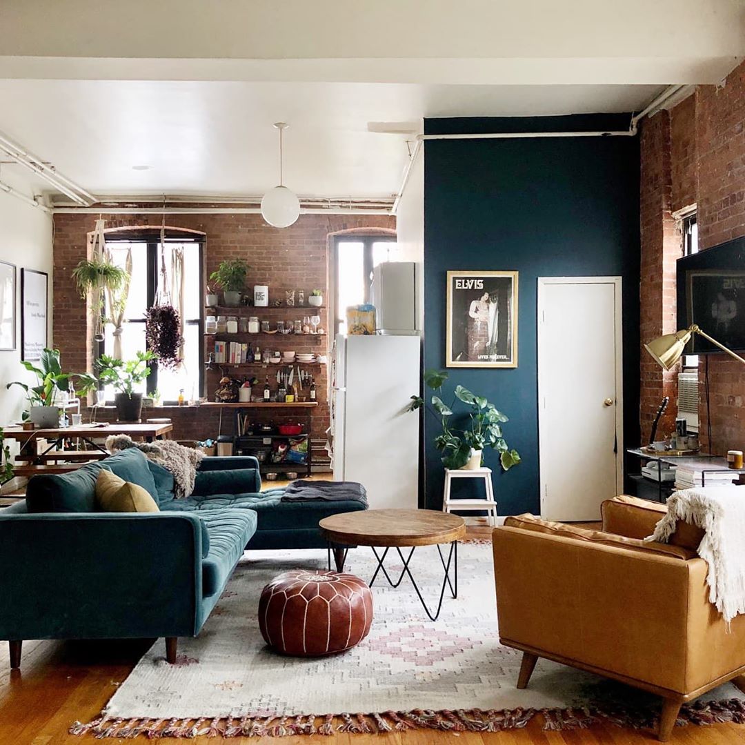
“Making a statement is easy with expressive dark colors like Broadway, Nocturne Blue, Royal Orchard and Barnwood Gray,” we read on Behr’s website. Dark colors are bold when applied in interiors and the effect they produce can be quite striking. This palette of darker hues has just the right amount of reserve, so it does not disturb the balance of your home. Quiet Haven shows us that,“deep hues have a reassuringly sublime and dependable nature, delivering the effect of a peaceful oasis in your home.”
DORIS LESLIE BLAU CAN HELP YOU FIND THE RIGHT PERSIAN CARPET OR ORIENTAL RUG. WE HAVE A LARGE SHOWROOM IN NEW YORK CITY PLUS ONLINE CATALOGS AND SUPPLEMENTARY INFORMATION. FOR HELP CHOOSING A PRODUCT FOR YOUR NEEDS, CONTACT US ONLINE OR CALL 212-586-5511.
