What would life be without colors? Dull, for starters. Thankfully, we don’t have to worry about that. The world is full of hues and our major problem is rather deciding which one we fancy at the moment. Yet again, there is no need to fret. Ranks of expert decorators, designers and tastemakers usually do it for us. And thank them for that! A well-matched shade can completely transform an interior, giving it a proper flair. Here we present 5 colors that have recently made the headlines. Now, it’s time for them to make your décor!
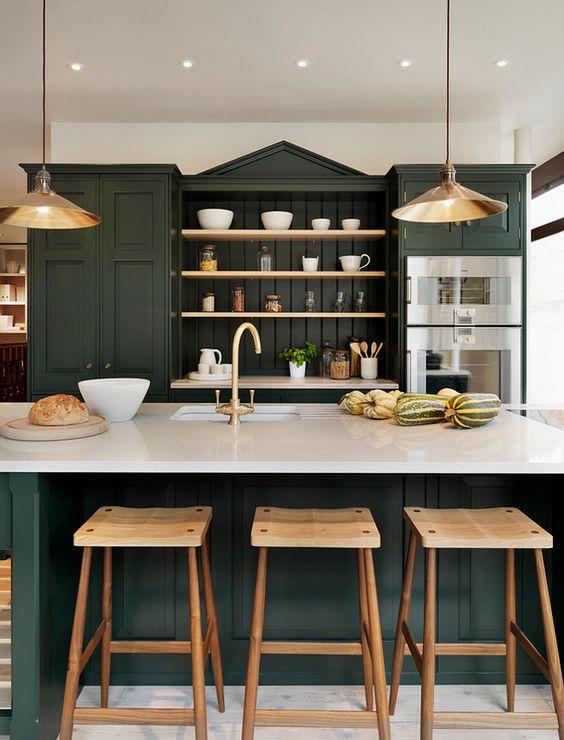
Hunter Green
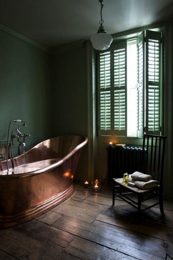
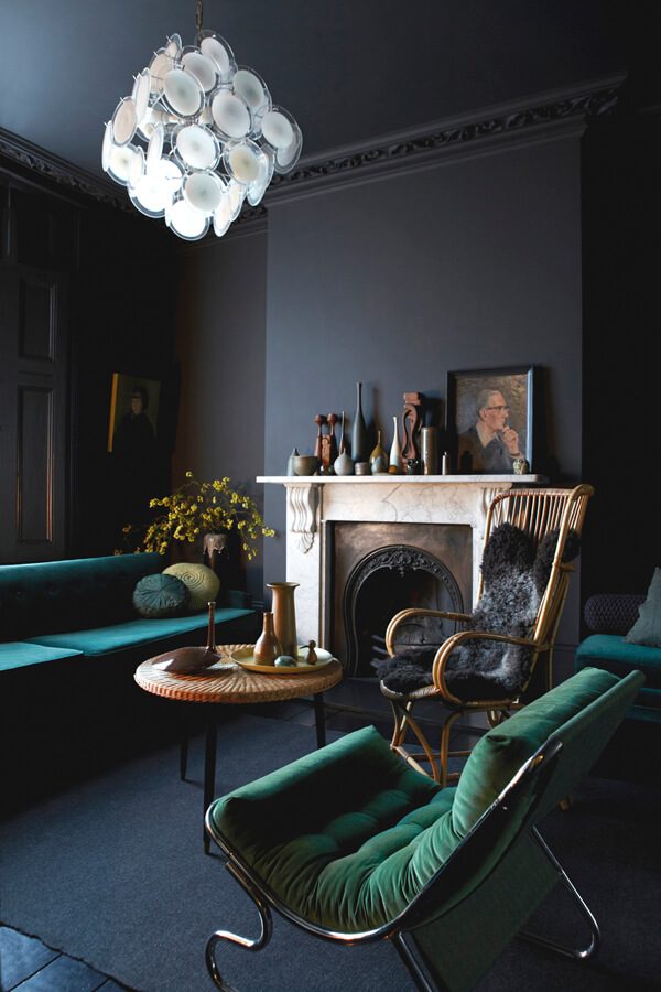
In 2017, green received a lot of unexpected attention which doesn’t seem to be fading. On the contrary, both the very color and its fame manage to take it to the next level every season. First, PANTONE announced Greenery as the hue of the year. Later came Sage, its more toned and delicate brother. Presently, the major craze is for Hunter Green.
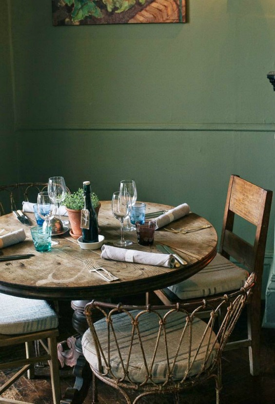
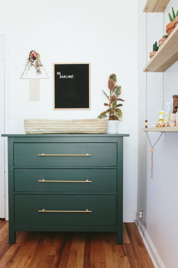
This saturated but unobtrusive emerald shade is by far our favorite. Particularly visible in the kitchens, it blends beautifully with marble countertops and wooden floors. Not to mention how wonderfully it affects our mood. Soothing and sophisticated, Hunter Green is a color worthy of a queen (or a king). 😉
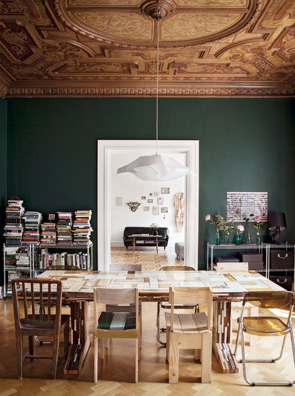
Caviar Black
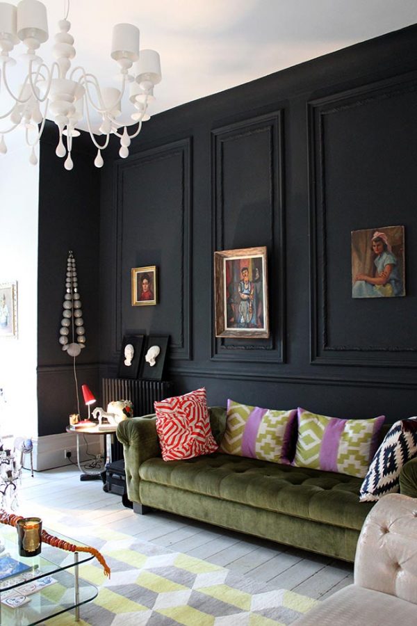
It’s been awfully long since we’ve seen so many interiors in black as presently. For obvious reasons, charcoal normally comes as an additional color, often in combination with the next hot trend – statement ceilings. We must admit, it’s a lovely pair. A black ceiling gives an interesting, contrasting effect even if the rest of the décor is completely toned down. Surprisingly, even good old black appears to have more faces than we expected. This year it shows us the one named ‘caviar’.
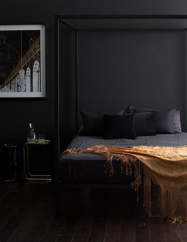
Very accurate, considering its high pigmentation resulting in extreme, almost glowing depth. Caviar Black pairs well with the palette of grays and won’t contrast too strongly with furniture in deeper shades. It will boost the character of any décor, regardless of whether it is in the form of paint for walls or furniture. Just watch out not to overdo it!
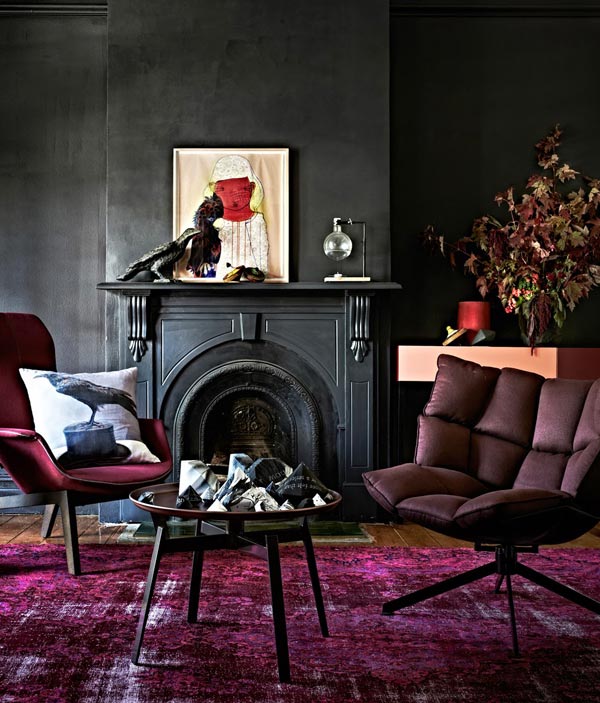
Ultraviolet
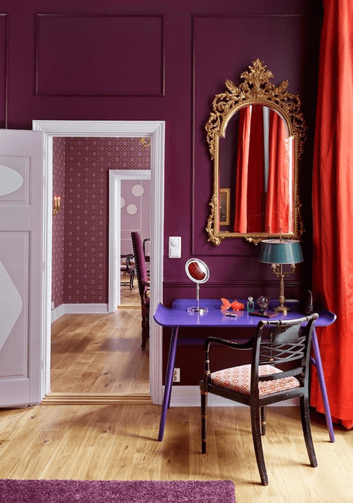
This hue probably doesn’t require any introduction. After all, it was appointed by PANTONE the color of 2018. As one of the so-called ‘jewel tones’, Ultraviolet has conquered the world of fashion, interior and wedding aesthetics. Intense and evoking strong associations with the Orient, it works beautifully in the form of accessories.
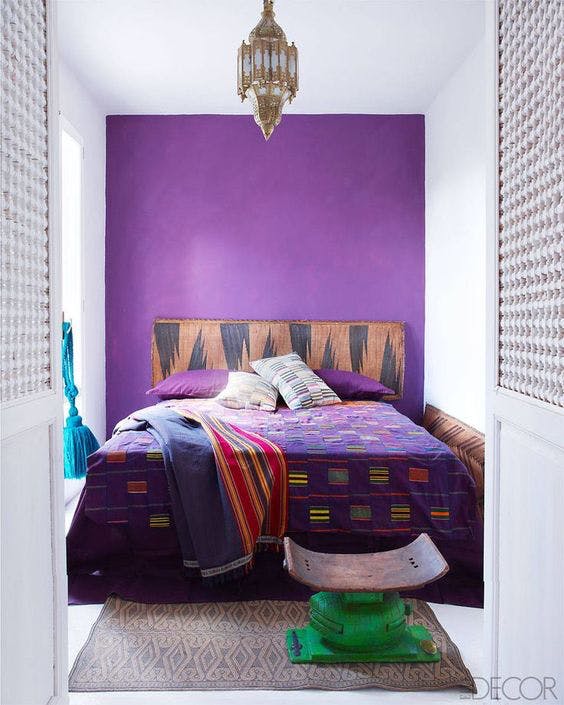
Therefore, violet upholstery sofas, pillows, curtains, tableware or rugs are the smoothest way to adopt a trend. Boring? If you want to make it less obvious and more edgy, couple it with the Wabi-Sabi style. How? For example, by preparing an unevenly painted wall. Trust us, the royal color in a ‘scruffy’ edition will be that ‘something’ which you’re constantly looking for.
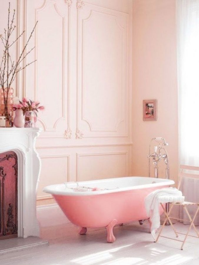
Powder Pink
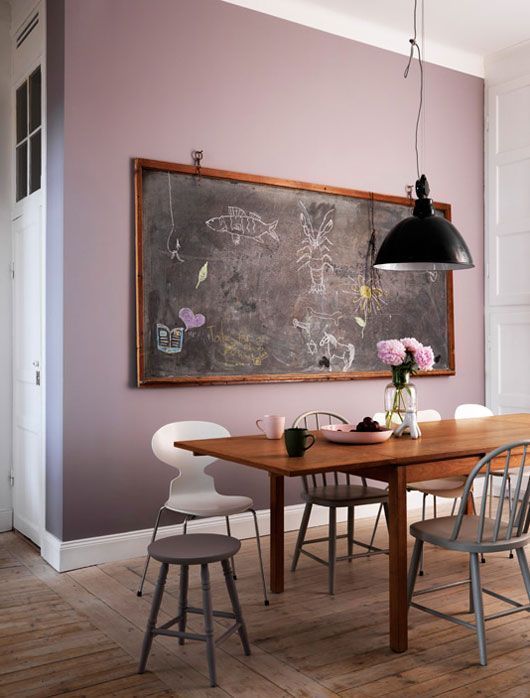
Ladies and gentlemen, time to celebrate. The ridiculous gendered connotations in relation to colors are finally coming to an end! Well, to be honest, there are still things to be done in the matter but we can see the light in the tunnel. Due to the general acquiescence, brilliant shades like Powder Pink are disregarded no more.
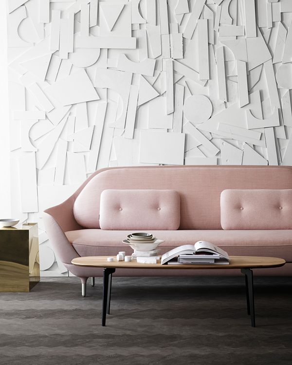
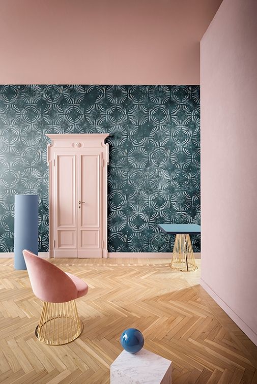
At last! Subtle but loaded with potential, Powder Pink has a lot to offer. Everyone can relate to it in one way or another – it evokes a wide array of feelings, from joy to passion. According to Leatrice Eiseman, the Pantone Color Institute’s executive director, “Pink has developed more power than ever before.” Thus, if you want to enhance the mood of a room in a controlled way, go with Powder Pink.
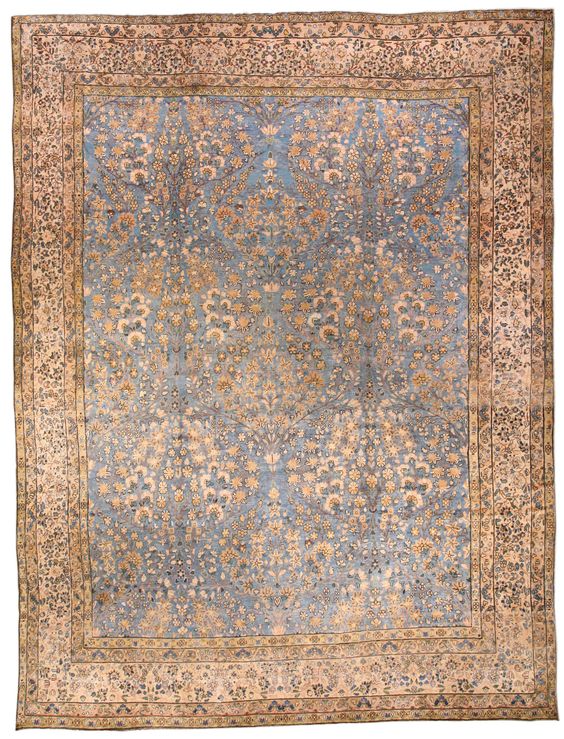
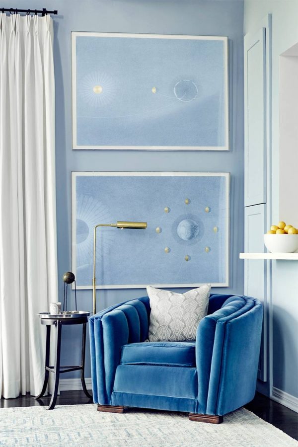
Serene Blues
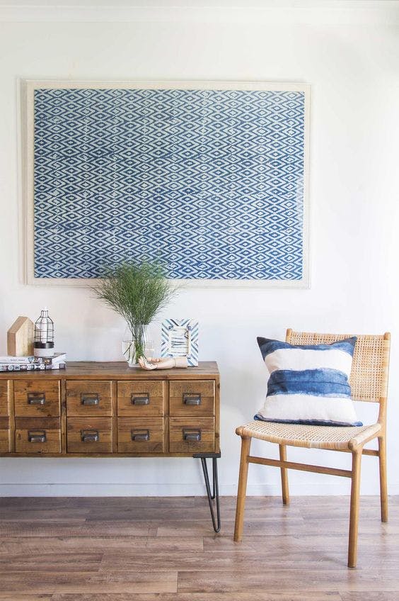
The fast-spreading popularity of green and various dusty hues proves that people really crave peace. Stuck in urban jungles, we seek refuge in small islands of serenity where we can unplug and actually relax. Obviously, colors play a major role in creating the ambience. When it comes to introducing tranquility, serene shades of blue are absolutely unmatched! It shows in the market.
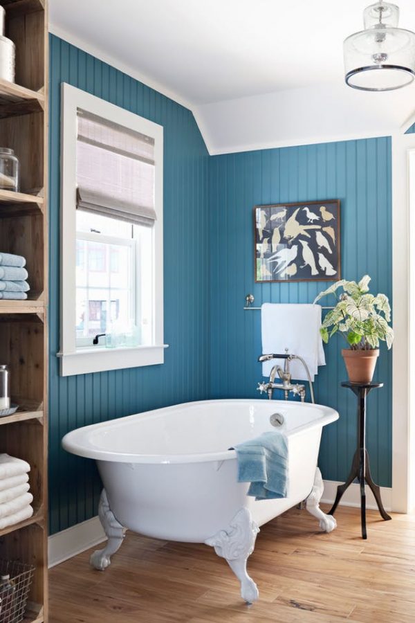
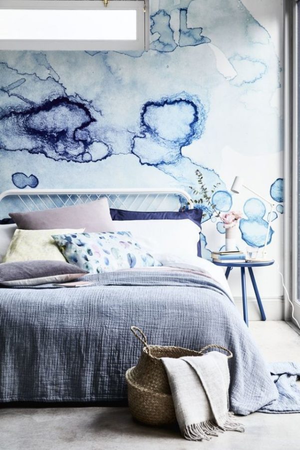
Behr’s first-ever Color Of The Year is accurately called In The Moment T18-15. It’s a calm blue that immediately lets you take a breather.
“In The Moment speaks to our society’s desire to disconnect and be present,” explains Erika Woelfel, vice president of color and creative services at Behr. “It crosses multiple design styles — global, coastal, modern — and pairs well with other subdued colors to create harmony for interiors or exteriors.”