Stripes are a classic pattern. For decades, stripes have donned men’s dress shirts and pin-striped suits – even fun pool cushions. Inside the home, stripes are a conventional go-to decor pattern that can ring coastal, farmhouse, traditionally elegant, and modern.
1. The long and short of stripe direction
The orientation of the rug stripe can make a huge impact on the perceived size or length of a room. Let’s look at two runners as an example.
A stripe running the length of the rug will accentuate the length of the room it’s in. It’s a similar concept to petite people wearing vertical stripes to make them appear taller. Here, your eyes quickly follow the linear pattern down to the end, making the hallway appear quite elongated.
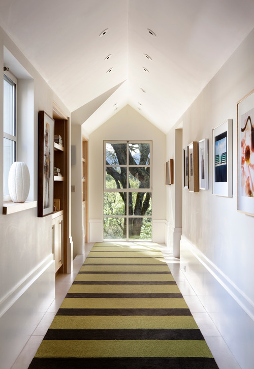
Alternatively, stripes running parallel with the short side of the rug will draw your eyes side-to-side instead of immediately down its length. So, if you have a short hallway or living room you want to appear longer or wider, orient the rug stripe in that direction.
2. Teaming up other patterns with bold stripes
High-contrast striped rugs, especially those that are two-toned, command a lot of attention and typically become the design centerpiece of the room. However, be careful to not introduce other design elements that compete too much.

This brown and cream striped rug from Doris Leslie Blau is the focal point of this living room designed by Alberto Pinto. The hide print on the two chairs doesn’t overpower the vivid striped rug design.

If you want to mix in more patterns with a high-contrast striped rug, keep them simple and graphic, and vary the scale. Here, this living room combines three additional patterns without looking chaotic: a chevron and a small stripe on two pillows, and a larger interlocking diamond on the pair of chairs.
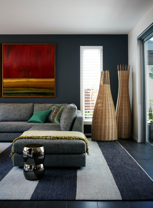
3. Stripes and color: Subdued or sassy?
You can also draw attention to or away from particular components depending on what colors are used in the rug.
The muted, earthy colors shown here – grays, blues, creams, and browns – are subdued and don’t detract from the real draw in this room, the ocean view outside. If you like the idea of stripes, but are a little timid to go the ultra-bold route, selecting one in calming hues is a good place to start.
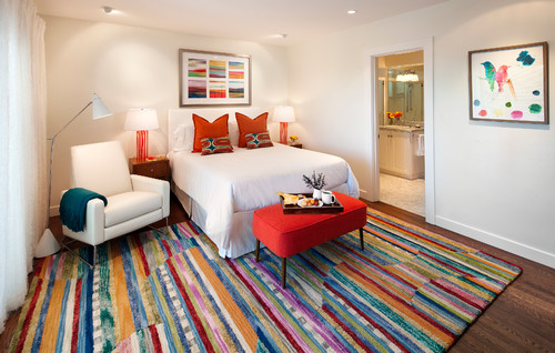
On the other hand, these intense, candy-colored stripes immediately draw your attention to the floor. Like their high-contrast counterpart, stripes in bright colors also visually “speak” loudly. They’re a good pick for a room you want to pump some festive energy into.
4. Stripe width relative to rug size
Confused about how big (or small) a rug you should use with different-sized stripes? There are no hard fast rules, but here are some points to consider:
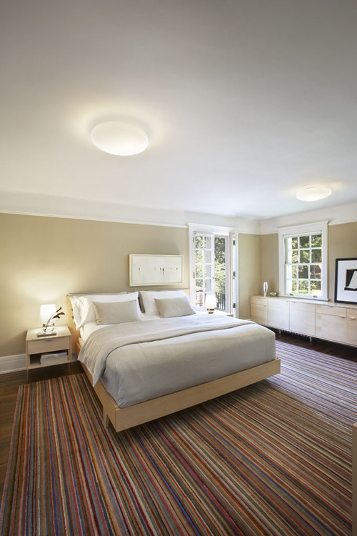
Small striped rugs are the most flexible in terms of rug sizing. They can almost read as textural versus an actual pattern, too. Thin pencil stripes look great on large rugs, like the bedroom-sized one shown here — and even a modest two-by-three foot size you might use in a small hallway.
Stripes that are medium-sized and highly graphic look best when they’re contained within a “zone”. Some examples are underneath a dining table, like shown here, or grounding a grouped seating area.
Using a room-size, high-contrast striped rug will likely look disorienting. While rug size is relative to the dimensions of the room, keeping busy stripes at bay in the medium-size range is ideal.
On the other hand, a huge stripe will only really work on an equally huge rug (in a comparatively-sized room!) These stripes are about fifteen inches wide, and their breadth actually makes them read as solid and unifying. The drawback is you’ll need the physical space to accommodate the rug.
—————————————————————————————————————-