Peaceful, elegant and tasteful – now it’s time to turn our attention to cold colors. We will show you which shades are cool and discuss how they influence both design and emotions. Stay tuned!
Get to Know Cool Colors
If we follow the division set by the absolute classification, cool colors are green, blue and purple. Oh, and all shades of grey, too. However, just as in case of warm hues, it is a purely subjective categorization and the term may refer to any chromatic color shifted in the color spectrum towards purple. Again, the example of green may come in handy – the olive shade is considered warm whereas the emerald is cool. In design, naming a color “cold” describes how it makes us feel and how we associate it rather than what actual color temperature it represents. And very well! After all, decorating is the subtle art of creating the perfect impression.

The Effect of Cold Hues on Interiors
Colder colors are said to calm the nerves, introduce a relaxing atmosphere and stimulate imagination. Is it possible for a color to actually have any effect on one’s mood? Sure it is, just as it’s absolutely plausible it may cause a room look bigger or smaller, darker or brighter. Cold hues are perfect for well sunlit interiors because they provide balance to the brightness. Moreover, they optically open up the space so if you literally want to save the day in a tiny bedroom or a small powder room, go with a delicate blue or grey shade there.
Colors can optically zoom in and out – hence their division into “attacking” and “subsiding”, which in practice is tantamount to splitting them into warm and cold colors. Warm colors give the impression of close, cold – distant. This rule applies to both dark and light colors of walls. The higher the saturation of warm colors, the closer they appear. In case of cool shades is the opposite – the more bleached they are, the more distant they seem. It is very good to know that while decorating the apartment. Walls usually look better in paler shades, whereas accessories should be more accented.
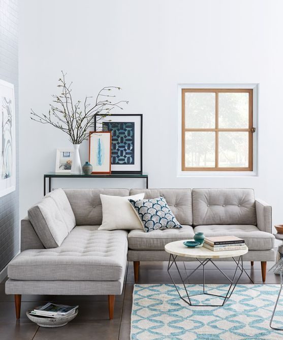
Blue
According to PANTONE, the denim shade of blue – Niagara – is the most fashionable choice in spring 2017. This hue will assist you in clearing your mind, calming down and restoring your inner harmony. As mentioned before, cooler shades work well in sunlit rooms because they compensate for the brightness of the sunrays, and also visually enlarge the space.

Sources: italianbark.com, villabetula.com
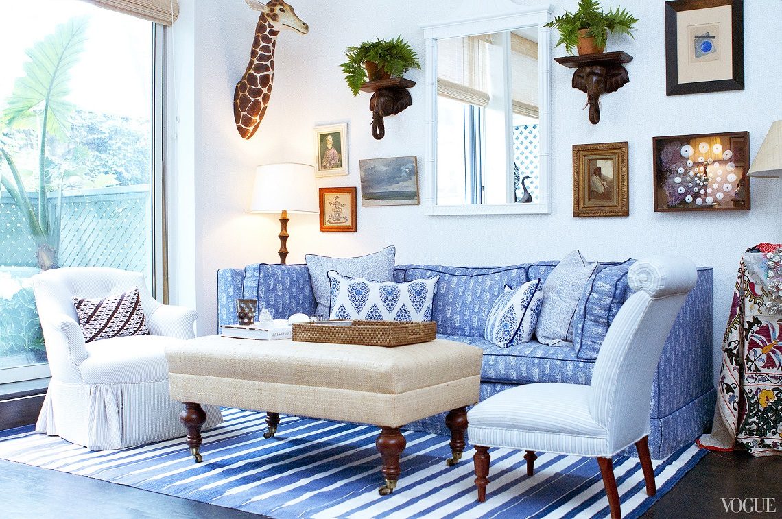
An extinguished shade of blue will look great on both walls and accessories as it is not overwhelming and easily fits into the arrangement. This color will help you to create the atmosphere of a seaside mansion in a Coastal style or it may become an addition to a traditional English manor décor. Shabby chic also loves blue in a washed-out version! A bed cover, cushions, vintage rug or a wall in pale blue will bring a refreshing breath of sea breeze into your abode.
Sources: jenwoodhouse.com, lauratrevey.com
Green
While blue has been chosen by PANTONE as the color of the spring season, greenery has been granted the title of the color of the year 2017 as it reflects our primary longing for wild nature. Green exudes calming vibes, it is a symbol of hope and new beginnings. Applied in a home office or a workspace, green will help us concentrate and spend a productive day. Accents in that color appear in a wide variety of decorating styles, from Scandinavian, through classical to the extremely popular Hollywood Regency décor. Why?

For a simple reason – practically everyone likes to have a home plant. Currently, we observe a strong trend in which cut flowers are being replaced by potted plants that are longer associated solely with a “grandma’s fern”. We are bombarded with brilliant ideas for flower arrangement in the house, including hanging flower baskets, decorative pots, and an array of possibilities for ingenious DIY. Also, there are absolutely intriguing specimens available on the market, such as different kinds of succulents, an eucalyptus, or a Zanzibar Gem. Immerse yourself into the soothing embrace of green and feel its salutary effects on your life and in your apartment.
Sources: ashandbrooks.com & Doris Leslie Blau Contemporary Rug

Grey
Some call it the new black, others – the new white. One thing is for sure – grey is ever in vogue. This is probably the most versatile color in decorating as it matches absolutely all styles, with the emphasis on modern, minimalistic and Scandinavian. Why is it so special? Grey helps to create neutral space, it gives a sense of calmness and adds a touch of elegance wherever it appears. Light grey paint is a perfect wall color due to its potential to make a room feel bigger.

Graphite or anthracite tones check out better in case of furniture or window frames, creating strong focal points and preventing boredom. It is an extremely popular color in contemporary and art-deco rugs. Combined with simple, geometric patterns, a grey shade on a carpet introduces the atmosphere of timeless chic and perfect harmony into any room.
Sources: thedebrief.co.uk, mywoodworkingsite.com

Katharina Berggreen
————————————————————————————————————————————————
Doris Leslie Blau Color Theory SHOW!
The unique Color Theory Show starts May 16th at 306 East 61st Street. A special opening reception on Tuesday, May 16, 2017, from 5 to 8 p.m., will focus on the use of color in design schemes. That’s not all. The centerpiece of the evening cocktail party will be a conversation between Donald Kaufman and designer Carey Maloney of M(Group). The two men will discuss the characteristic of carpet color versus paint color, how the color of a room relates to the color of a carpet and where tonal depth in carpets comes from. Every design aficionado should already be over the moon 😉 Make sure you don’t miss it!
Join the event on Facebook