How can we make outstanding, boundary-bursting design decisions while simultaneously resting assured that we aren’t going overboard?
It’s not easy, but keeping the following in mind can safeguard against creating something that will seem prematurely dated in years to come.
Know Thyself
I loved the mint-colored runway looks of spring 2012, but that pastel green wasn’t a longstanding favorite of mine, so it would’ve been a mistake to entirely redo my wardrobe with it. The same goes for interiors. Don’t get talked into a color or aesthetic trend because it’s hot now if you weren’t previously drawn to it.
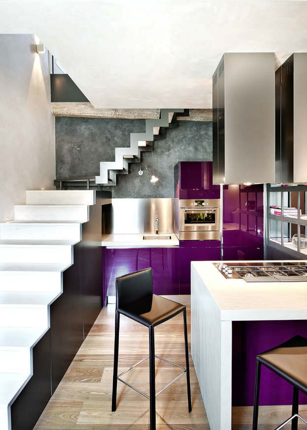
These violet kitchen accents paired with sharp structural lines are absolutely electrifying, but I assume the choice was a deeply personal one – no one else could tell someone this was the right decision for him or her.
Know the History
Cost, materials and quality are obviously crucial information for big purchases, but digging deeper, knowing a bit about the biography of a furniture piece or textile will ensure better decision-making. Plus, an item that has already stood the test of time is unlikely to look tired in the near future.
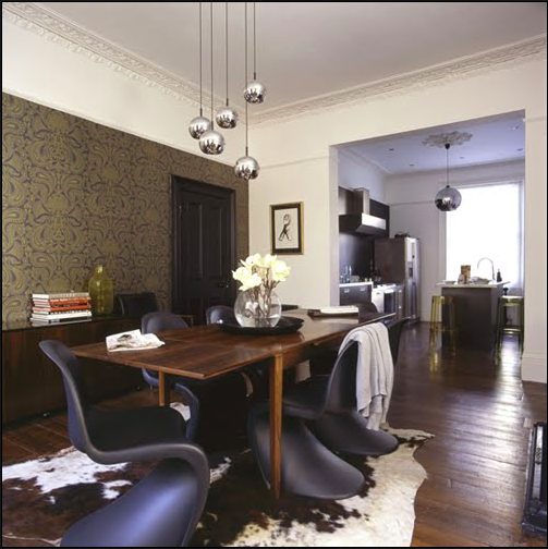
One of the world’s most recognizable design pieces, the world’s first chair molded out of a single piece of plastic debuted in the 1960s. Just like George Nelson’s iconic bubble lamp the panton chair still looks sharp in contemporary interiors despite its age.
The lamp and chair are modern examples, but the same goes for older pieces. This 19th-century cinnamon field needlework carpet is so vibrant and lush, it could be incorporated into many aesthetic modes.
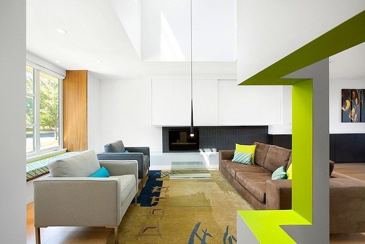
Often it’s an eye-catching shade that really makes a room pop. But don’t feel bad if you aren’t ready to commit to a chromatic accent wall, even just a limited surface area and a couple throw pillows can energize a space.
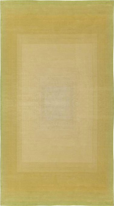
Not so neon, but no less stunning: this lovely lime silk ombré rug would add warmth and depth to any room.
Don’t Fear Darkness
So many homes and offices become lifeless vistas of muted colors and beige because we think those are ‘safe,’ whereas dark shades are perceived as high-risk and unwelcoming.
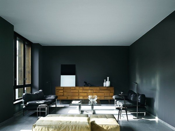
This is nonsense. You can find eclectic lounges, rustic cabins and contemporary kitchens all done in a delightful ebony that isn’t remotely gothic.
Despite their long winters, Scandinavian designers in particular have embraced black. The room pictured above is unequivocally gutsy. High ceilings, big windows and simple, low-backed furniture keep it from feeling cramped or gloomy.
Not ready for nighttime? Slate, wine, hunter green or aubergine purple can all add richness and a sense of intimacy.
Be a Local
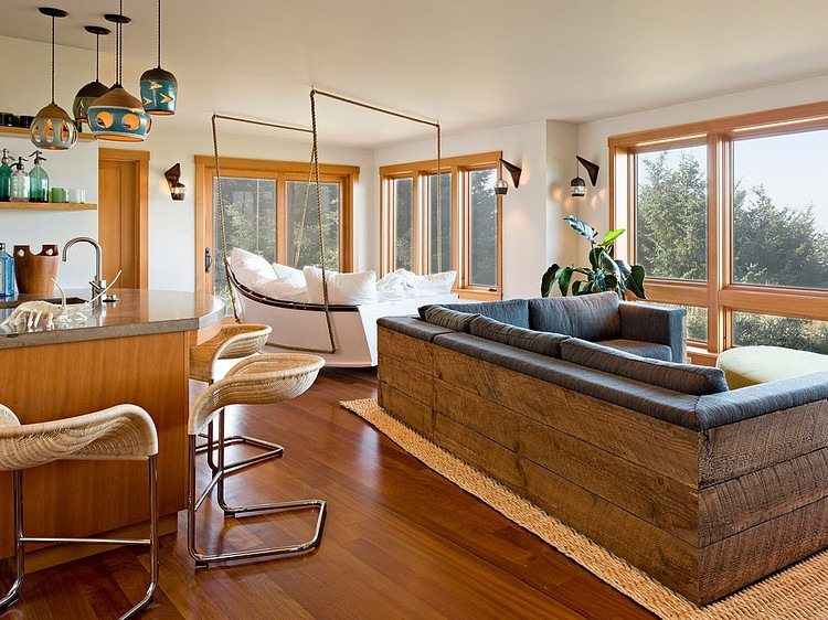
Design that has a sense of place will endure. This Oregon-Coast home by Jessica Helgerson has a nautical sofa and a sectional with a backside that looks like dock planks – perfect for seaside living – but the nuance extends well beyond that: wood accents, aquamarine pendant lamps, blond chairs and rugs perfectly reflect the crashing tides, driftwood and multi-hued beach rocks that wash up on the Oregon Coast.
A whole house doesn’t have to serve as homage to its geolocation, but incorporating local elements and acknowledging the aesthetic tradition of a place – even if you’re not going to abide by it 100% – will bring continuity to a space: It will make it feel like it belongs where it is, and that will make it last.
