

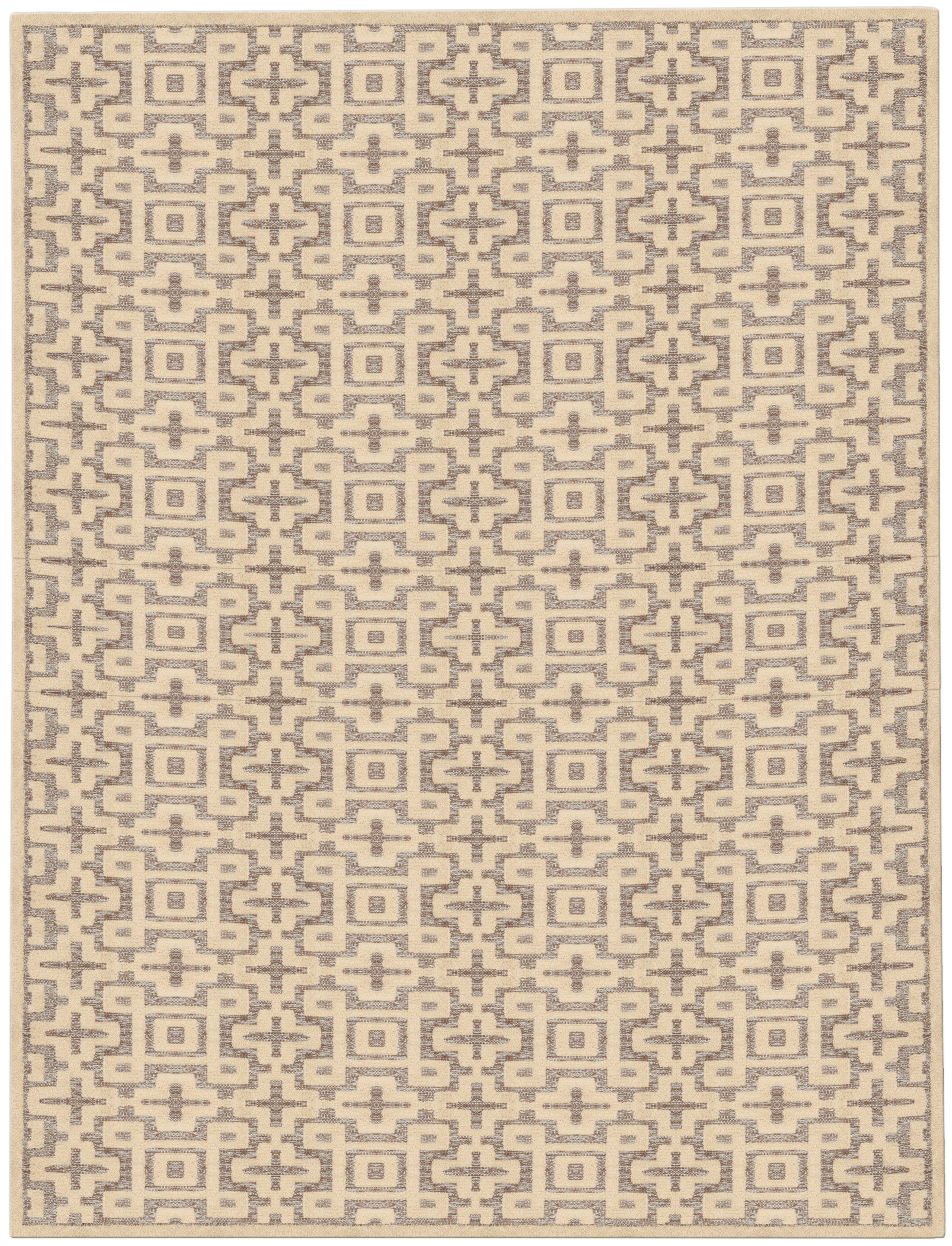
Matching rugs to fabrics is less about replication than about calibration. The strongest rooms usually share a family resemblance: a common undertone, a related level of contrast, or a similar visual weight. When custom rugs are specified well, they do not mimic upholstery or drapery; they give the room a grounded counterpoint so the whole composition feels considered rather than overly arranged.
Designers often run into the same problem in refined interiors: the sofa is upholstered in one quiet neutral, the drapery has another, and the rug is chosen to “match” both so closely that the room loses depth. The result is tidy, but not persuasive. A better approach is to think in layers, where textiles can share a tonal conversation without wearing the same outfit. That means respecting undertones, texture, and scale at the same time, especially when you are working with designer custom rugs in a room that already has strong architectural finishes.
There is also a practical reason to avoid overmatching. Fabrics absorb and reflect light differently than woven or knotted floor coverings, so a color that appears aligned on a sample board can separate once installed. Wool upholstery may read softer and warmer than a rug in the same nominal beige, and linen drapery can appear cooler when daylight shifts across it. The goal is not sameness; it is coherence under changing light.
Choose one material family to lead
The easiest way to avoid a too-perfect scheme is to decide which material family should carry the dominant visual note. In a room with velvet seating, silk-trimmed drapery, and lacquered tables, the rug should usually be the stabilizing element rather than the most decorative one. If the upholstery is tactile and saturated, a quieter ground in wool or a wool-silk blend can keep the composition from feeling crowded. If the furniture is restrained, then the rug can introduce more pattern or a richer construction without the room losing discipline.
This is where scale matters as much as color. A small, detailed rug under a large sectional can look visually fussy, while a generous custom piece with a broad pattern repeat can let fabric detail breathe. For rooms built around formal seating, one effective strategy is to choose a rug with a larger, slower motif and let the upholstery carry the finer texture. In contrast, when the sofa and chairs are simple and architectural, a more articulated surface can supply the needed rhythm.
For clients who want the room to feel intentional but not contrived, I often suggest starting with the largest and most fixed element: the floor covering. That does not mean the rug must be the loudest object in the room. It means the rug can establish the tonal base, after which fabrics are selected to either sit within that range or create a controlled shift. This is one reason hand-knotted rugs are so useful in specification: their construction often gives designers the nuance needed to bridge several finishes without forcing them into exact alignment.
Balance undertones across soft and hard finishes
Undertone is where many otherwise elegant schemes begin to unravel. A cream with a pink base will not behave like a cream with a yellow base, and neither will pair equally well with walnut, honed stone, or brushed bronze. When matching rugs to wall finishes, the same rule applies: the rug does not need to mirror the wall color, but it should respect the temperature of the room. Cool plaster, warm oak, and muted textile shades can coexist beautifully when the undertones are acknowledged instead of ignored.
Hard finishes deserve the same attention. Marble veining, metal sheen, and stained wood all affect how textiles are read in the space. If the walls are a warm limewash and the millwork is deep-stained oak, a rug with a slightly earthy cast may settle the room better than one that is bright or chalky. If the envelope is cooler and more architectural, a restrained mineral palette can keep the room from drifting into heaviness. The smartest custom rug design rarely chases the exact wall color; it echoes the room’s temperature while giving it a degree of relief.
A useful test is to stand back and evaluate the room in levels, not just in swatches. Ask whether the rug is warmer or cooler than the sofa, whether the chair fabric has more saturation than the curtains, and whether the floor covering connects or competes with the wall finish. In open-plan interiors, this becomes even more important because one rug may need to bridge several zones and multiple materials. A single custom-made rug can quietly unify adjacent finishes if its undertone sits between them rather than on top of them.
Use texture to prevent visual sameness
Texture is the safest way to make a room feel layered when the palette is restrained. A sofa in brushed wool, for example, can pair beautifully with a rug that has a denser hand, a soft abrash, or a subtle mix of pile heights. That difference keeps the eye moving even when the colors are close. If both the fabric and the rug are matte, flat, and similarly scaled, the scheme can become inert; if one surface is richer or more dimensional, the room gains depth without increasing contrast.
This is especially relevant in quiet luxury interiors, where the goal is often to avoid visual noise. A low-pile rug with a refined pattern can work well under more textural upholstery, while a plush custom carpet may be the right foil for linen slipcovers and pared-back seating. The key is to vary the tactile register. A velvet armchair, a nubby wool ottoman, and a hand-knotted ground with subtle sheen can feel composed precisely because each surface contributes a different kind of light absorption and reflection.
Texture also helps when color choices are intentionally close. Rooms in one tonal family can still feel dimensional if the rug introduces a gentle directional weave, a distressed field, or a border that reads differently from the center. In practical terms, this is often more successful than choosing a rug that matches the upholstery exactly. Exact matching can flatten the room’s contours, while a considered contrast in construction gives the space definition without breaking harmony.
For homeowners weighing durability as well as appearance, texture can do double duty. A family room with pets and frequent use may benefit from a wool rug with a forgiving surface and a pattern that disguises everyday wear, especially if the seating fabrics are already visually calm. A more formal room can tolerate greater delicacy, but even there, a little surface variation keeps the scheme from feeling staged. This is one of the reasons designers often specify made-to-order rugs rather than relying on a standard rectangle from a showroom floor.
Plan the relationship to the room, not only to the furniture
Rugs are often chosen in relation to a sofa or a pair of chairs, but the better question is how the rug participates in the room as a whole. In a living room with tall windows, a substantial rug can counterbalance the vertical weight of drapery and wall treatment. In a dining area, the rug should support the geometry of the table while leaving enough visual margin so the furniture does not feel trapped. In both cases, the floor covering should relate to fabrics, but it should also relate to circulation, architecture, and sightlines.
Consider a scenario where a designer is specifying a rug for a room with ivory linen curtains, a taupe mohair sofa, and walnut tables. If the rug repeats the sofa color exactly, the space may lose contrast at floor level and feel overly uniform. A better solution might be a custom rug with a slightly deeper ground, a softened border, or a warm gray-brown palette that recognizes both the linen and the wood. The room then reads as coordinated, but each material still retains its own identity.
This logic is useful in rooms that mix old and new pieces, too. Antique seating often has a different tactile presence than contemporary upholstery, and that difference should be allowed to register. A rug that is too closely matched to the newer fabric can make the older piece feel disconnected, while a rug that is too decorative can overwhelm the restraint of a modern sofa. Thoughtful custom carpets can bridge that gap by carrying both age and clarity in their palette or drawing.
Explain the relationship to clients in clear design language
When presenting a scheme to clients, it helps to describe the rug as a connector rather than a copy. Instead of saying the rug should “match” the curtains, you might explain that it should sit within the same temperature range and provide a softer counterpoint to the upholstery. Clients usually understand this quickly when they see how a room improves once every fabric is not competing for exact sameness. The language matters, because it shifts the conversation from replication to composition.
Visual tools can make the distinction even clearer. Place the rug sample beside the largest fabric, then add the wall finish and one hard material, such as wood or stone, so the client can see the full field of interaction. It is often useful to show a slightly warmer and a slightly cooler option, not because one is “right” and the other is “wrong,” but because subtle shifts in undertone can dramatically change the character of the room. Designers working with custom rug sizing guide principles know that proportion and finish should be reviewed together, not as separate decisions.
Be specific about what the rug is meant to do. If the room needs visual calm, say that the custom rug should anchor the palette and allow the upholstery to read as the softer layer. If the room lacks energy, say that the floor covering should introduce movement through pattern density or pile variation. When clients understand the role of each textile, they are less likely to ask for exact duplication across the scheme, and more likely to appreciate a room that feels deliberate without being overcontrolled.
For designers sourcing through specialists such as Doris Leslie Blau, this is also where material expertise becomes valuable. The right shop can translate a concept into a construction that suits the room’s actual use, from a dense hand-knotted field for a formal sitting room to a more tactile weave for a relaxed library or bedroom. In that sense, custom-made rugs are not only about dimensions and pattern; they are a way to tune the relationship between fabric, light, and the architecture surrounding them.
Small decisions that keep the scheme from feeling overworked
- Let one textile carry the strongest texture and keep the others quieter.
- Choose a rug that is related to the upholstery, not identical to it.
- Check samples in both daylight and evening light before final approval.
- Use a slightly different value or undertone to separate adjacent fabrics.
- Vary pile height, sheen, or weave density so the room has tactile contrast.
- Review the rug in context with wall finishes, wood tones, and metal hardware.
FAQ
Should rugs match upholstery exactly?
Usually, no. Exact matching can make a room look flat and overly engineered. It is better to aim for a close relationship in undertone, value, or texture while preserving enough difference for each material to read clearly on its own.
How do I avoid a scheme that feels too coordinated?
Introduce one meaningful variation: a deeper or lighter tone, a different pile height, a more open pattern, or a texture contrast between rug and fabric. If every surface is similarly calm, the room can lose depth. A controlled mismatch often feels more refined than a perfect match.
What matters more: color or texture?
Both matter, but texture often resolves problems that color alone cannot. If the colors are close, a difference in weave, sheen, or surface density can keep the room from feeling monotonous. If the texture is already rich, then color can remain quieter and still hold the composition together.
Can matching rugs to wall finishes help a room feel more finished?
Yes, as long as the rug is coordinated with the wall finish rather than copied from it. Matching rugs to wall finishes works best when the undertones are compatible and the rug adds a slightly different level of depth. That balance makes the room feel resolved without becoming formulaic.
When the goal is a room with restraint, the smartest rug is often the one that knows how to disagree politely. A thoughtful palette, the right construction, and attention to proportion can make the entire scheme feel more layered, not less coordinated. If you are refining a project and need help selecting the right material, scale, or tone, specialist guidance can make the difference between a polished room and one that feels merely matched.