

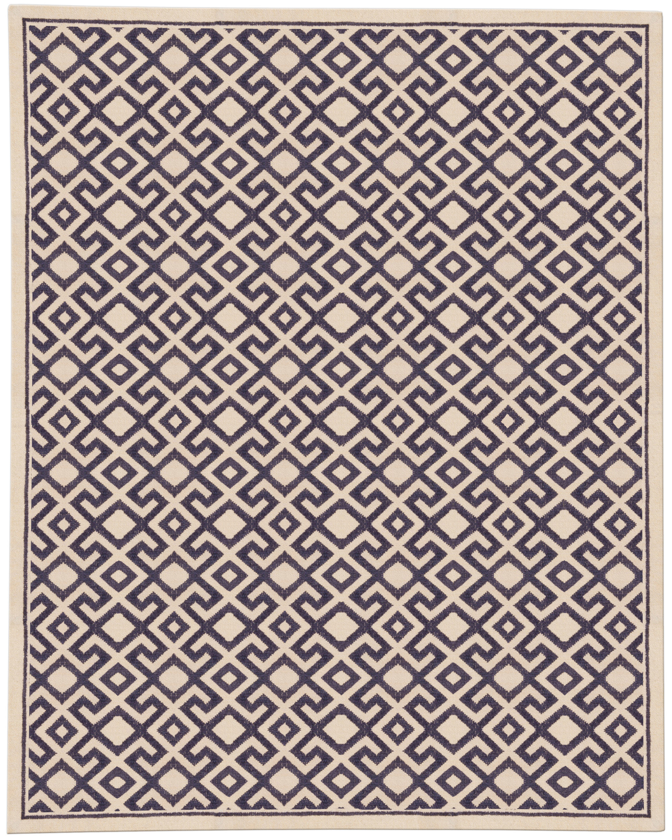
When a room already has stone veining, a distinctive wood tone, saturated artwork, or a confident upholstery color, the rug cannot be treated as an afterthought. The right color choice should steady the composition, connect the major finishes, and give the room a visual base without competing for attention. That is where custom rug design becomes especially valuable, because a made-to-order piece can be tuned to the exact undertones, scale, and lighting conditions of the space.
The question of how to choose rug color is rarely about picking a favorite hue. In a finished room, color works as architecture: it affects how large the room feels, where the eye goes first, and whether the strongest elements read as intentional or accidental. A rug that is too literal can flatten the room, while one that is too quiet can disappear under heavy finishes. The best result often comes from choosing a color that either bridges existing tones or introduces a controlled contrast with enough softness to feel integrated.
At Doris Leslie Blau, the most successful rug selections usually begin with the room itself, not with a sample card. Stone, walnut, brass, lacquer, upholstery, and art each carry their own temperature and density, so the rug has to be read in relation to all of them. In practice, that means identifying undertones, checking how those undertones behave in daylight and lamplight, and deciding whether the rug should temper the room or sharpen it. That method is especially important for custom rugs, where color, scale, and construction can be calibrated together rather than compromised separately.
Read the dominant undertones in the room
Before considering exact shades, identify whether the room leans warm, cool, or deliberately mixed. A limestone floor may look neutral at first glance, but it can carry a creamy, yellowed, or slightly pink cast depending on the finish and the light. Likewise, a walnut cabinet run may present as brown, yet its red, chocolate, or smoky undertone will influence every neighboring textile. The rug should answer those undertones directly, not fight them with a color that belongs to another temperature family.
This is where many projects go wrong: a room with warm oak and camel leather receives a rug with icy gray or blue notes, and the result feels disconnected even if the palette is technically “neutral.” In other spaces, the problem is the opposite, with a golden rug placed beside cool marble and pale plaster, creating a haze of unrelated warmth. A more disciplined approach is to name the dominant temperature of the room, then choose whether the rug should echo it, soften it, or introduce a slight offset. That offset can be subtle; a muted slate-blue field beside warm woods can read more coherent than a brighter blue because the gray content keeps the color grounded.
For rooms built around stone and wood, earthy color palettes often provide the most forgiving foundation. Moss, olive, clay, tobacco, sand, and weathered taupe can absorb competing finishes without collapsing into monotony. These tones work particularly well when the room contains natural materials with visible grain or veining, because they preserve depth rather than forcing a high-contrast statement. In a highly designed room, the goal is not to neutralize character but to distribute it evenly so the strongest pieces do not monopolize the composition.
Decide whether the rug should bridge or contrast existing finishes
A rug can play one of two strategic roles. It can bridge existing finishes by picking up elements from stone, wood, upholstery, and art so the room feels unified, or it can contrast them to define a focal area and introduce visual structure. Neither approach is inherently better; the right choice depends on how much visual activity already exists in the room and where you want the eye to rest. In interiors with multiple strong surfaces, bridging is often the safer and more elegant choice because it lowers the overall noise level.
Bridging works best when the room already contains a lot of information: bookmatched marble, paneling, bold artwork, and tailored furniture can easily overwhelm a rug with a rigid color story. A hand-knotted field in layered neutrals, broken blues, or restrained greens can gather those elements without making the room feel flat. If the surrounding finishes are all in the same family but differ in tone, the rug can introduce a slightly different value to keep the floor plane visible. That is one reason muted blues and greens often perform so well in complex rooms: they are chromatic enough to feel intentional, but subdued enough to sit between warm and cool materials.
Contrast is more useful when the room needs definition. A pale rug beneath dark built-ins, for example, can prevent a heavy perimeter from visually sinking the seating area. Similarly, a darker rug can give a light, stone-heavy room a sense of grounding and prevent the furniture from floating. The key is to keep the contrast controlled. A black-and-white solution may look graphic in a showroom, but in a furnished room with strong finishes it can become the loudest element in the space, which is rarely the goal when you are trying to coordinate rather than dominate.
A practical example
Consider a living room with honey oak floors, a rust-colored leather chair, a low limestone fireplace, and a painting that contains blue-gray and umber. A rug in a hard beige would likely disappear, while a vivid cobalt ground would pull focus away from the fireplace and chair. A better solution might be a faded blue-green or mineral-inspired neutral with warm undertones, perhaps with a softened border that echoes the linearity of the room. That choice would give the eye a place to rest while allowing the wood, stone, and art to remain legible.
Test color under day and evening light
Rug color is never static. Sunlight can push green toward yellow, gray toward blue, and beige toward pink, while evening light can make the same rug look deeper, dustier, or more saturated. A room with strong finishes often has multiple lighting conditions within the same day, so a color that looks calm in the morning may become confrontational at night. This is why a rug should be evaluated in situ, not only under showroom lighting or in a digital rendering.
Place samples where the rug will actually sit and observe them at different times of day. Morning light tends to reveal the truest relationship between the rug and the floor, especially if the room has east-facing exposure. Late afternoon and evening can be more revealing for lamp-lit rooms, because artificial light often amplifies red and yellow undertones. If the room uses a mix of recessed lighting and table lamps, check both, since a rug that reads balanced in one source may skew unexpectedly in another.
Fiber and construction also affect how a color behaves. Wool tends to soften color and reduce glare, which is useful when the surrounding finishes are already reflective or high contrast. Silk adds luminosity and can make a color read more saturated, which may be desirable in a formal room but too assertive in a space with a lot of stone or polished wood. Hand-knotted rugs often show more tonal movement than machine-made surfaces, so the same “color” may contain subtle striations that help it sit more naturally beside complex materials. When you are evaluating custom rugs, those nuances matter because the texture itself becomes part of the color story.
Use samples to confirm the rug does not compete with key features
A good rug supports the room’s hierarchy. It should not pull attention away from a painting, a sculptural table, a fireplace surround, or a major upholstery piece that already defines the space. The easiest way to test this is to place samples near the dominant features and then step back to see what becomes visually loud. If the rug sample creates a new focal point where one is not needed, the color is probably too saturated, too bright, or too patterned for the room.
In rooms with strong art, the rug should often borrow from secondary tones rather than the main pigment of the artwork. Repeating the exact color found in a painting can feel overly coordinated, especially if the art is already the room’s emotional center. Instead, select a rug that picks up the painting’s quieter notes: the shadow under a figure, the background haze, the faded edge of a frame, or the color of unpainted canvas. That approach creates a relationship without turning the rug into a visual echo chamber.
The same principle applies to upholstery. If a sofa is in a saturated textile, the rug usually performs best when it sits one step quieter in value or chroma. That does not mean it must be neutral, only that it should not compete in the same register. A room with a navy velvet sofa, for instance, may benefit from a rug with soft mineral grays, smoky blues, or muted greens that preserve depth without matching the sofa too closely. If the sofa is already the strongest block of color, the rug should act as a stabilizer and help the seating area feel complete rather than crowded.
Pattern density should be reviewed at the same time as color. A rug with a complex repeat in a strong palette may feel visually busier than expected once it is installed under furniture and viewed at a distance. Conversely, a largely tonal rug with subtle abrash or distressed movement can deliver enough interest to stand up to dramatic finishes without introducing extra pattern noise. In rooms where the architecture and furniture are already expressive, restrained pattern often yields a more luxurious result than literal decoration.
Color directions that work well with strong finishes
Not every room needs a neutral rug, but many rooms with assertive materials benefit from colors that are softened, weathered, or mineral-like. Deep browns, mushroom grays, olive-based neutrals, and smoke-toned blues can create cohesion without looking bland. These colors are especially effective in rooms where the wood has a visible red cast or the stone leans warm, because they moderate the warmth rather than amplifying it. If the room is cooler overall, consider chalkier neutrals, blue-grays, or softened jade tones that add body without turning icy.
Muted blues and greens deserve special attention because they often bridge mixed finishes more gracefully than pure neutrals. A blue with enough gray can calm a room dominated by warm woods, while a green with olive or sage undertones can connect stone and upholstery in a way that feels architectural rather than decorative. These colors are also useful in rooms with art because they recede at the right moments and then reappear as the eye moves around the space. The result is a floor covering that contributes rhythm instead of interruption.
If the room already contains several natural materials, a rug with subtle tonal variation may be more effective than a single flat color. Striations, abrash, and gently faded transitions can mimic the irregularity of stone and timber, allowing the rug to feel embedded in the room rather than placed on top of it. This is one reason handcrafted surfaces often read more successfully in complicated interiors: their slight irregularities give the eye a place to settle. In a carefully specified custom rug, those nuances can be emphasized or minimized depending on how much movement the room can accommodate.
How material and pile height affect the reading of color
Color cannot be separated from texture. A low pile will reflect light differently from a dense cut pile, and a high-luster fiber will shift more noticeably as you move through the room. If the finishes are already active, such as honed stone, figured wood, or polished metal, a matte or semi-matte rug surface usually makes the color read more stable. If the room is visually quiet but formally strong, a silk accent or low-sheen detail may be welcome because it adds refinement without altering the palette.
Pile height also influences proportion. A thick, plush rug in a subdued color can still feel assertive if it creates a heavy visual plane under refined furniture. By contrast, a flatter construction can make the color seem more precise and architectural. That distinction matters in dining rooms, libraries, and open-plan living spaces where the rug must hold together distinct zones. When choosing custom rugs for those settings, it helps to think of the floor covering as part of the room’s sectional drawing, not just as a decorative field.
For interiors with strong finishes, hand-knotted rugs often offer the best balance between color sophistication and long-term adaptability. They can carry nuanced palettes, show depth without glare, and accommodate subtle shifts in surrounding materials over time. That makes them especially useful in rooms where furniture, art, or accessories may change but the major finishes will remain fixed. A well-made rug should be able to live through those adjustments without becoming dated or visually detached.
Designer-level checks before you commit
- Compare the rug sample against the floor, wall finish, and upholstery together, not one at a time.
- Check whether the rug color becomes warmer or cooler under the room’s primary light sources.
- Step back to the room’s entry point and see whether the rug supports the main focal feature.
- Assess whether the palette feels balanced from multiple angles, especially in open-plan interiors.
- Confirm that the rug’s pattern density matches the amount of visual activity already in the room.
If a room has a strong foundation, the rug should be chosen with the same rigor as the furnishings. That is why services such as custom rug sizing guide consultations and material review can be so useful: they help align color, proportion, and construction before the piece is made. A rug that is too small, too saturated, or too neutral can all undermine a carefully composed interior. Precision matters because the rug is not isolated from the rest of the room; it is one of the elements that tells the eye how the room should be read.
FAQ
Should a rug match the sofa or the floor?
Usually neither exactly. A rug that matches the sofa too closely can make the seating area feel flat, while a rug that copies the floor often disappears. The better approach is to choose a color that sits between the two or gently offsets one of them, so the room feels coordinated without looking repetitive.
How do I avoid a color that feels too cold or too warm?
Check the rug sample next to the room’s actual materials, because temperature is relative. If the room already contains warm woods or creamy stone, a cooler rug may need some gray content to keep it from feeling stark. If the room is predominantly cool, a rug with a touch of earth or olive can prevent it from feeling rigid or clinical.
Can a rug repeat the art without looking forced?
Yes, but it should usually repeat a secondary note rather than the main color. Pulling from a shadow, background wash, or muted accent is more convincing than copying the dominant pigment. That keeps the connection subtle and allows the artwork to remain the visual lead.
What is the safest color strategy for a room with many strong finishes?
A nuanced neutral or a muted color family often works best, especially when there are several materials already competing for attention. Think in terms of value, undertone, and texture instead of chasing a single exact shade. Soft mineral colors, earthy color palettes, and muted blues and greens often provide enough character to feel intentional while still giving the room breathing room.
Choosing rug color in a room with strong finishes is ultimately an exercise in restraint, comparison, and clarity. The best results come from reading the room as a whole, testing color in real light, and selecting a rug that supports the hierarchy rather than flattening it. If you are weighing several directions for a difficult space, Doris Leslie Blau can help you refine the palette, scale, and construction so the final piece feels resolved from the floor up.