

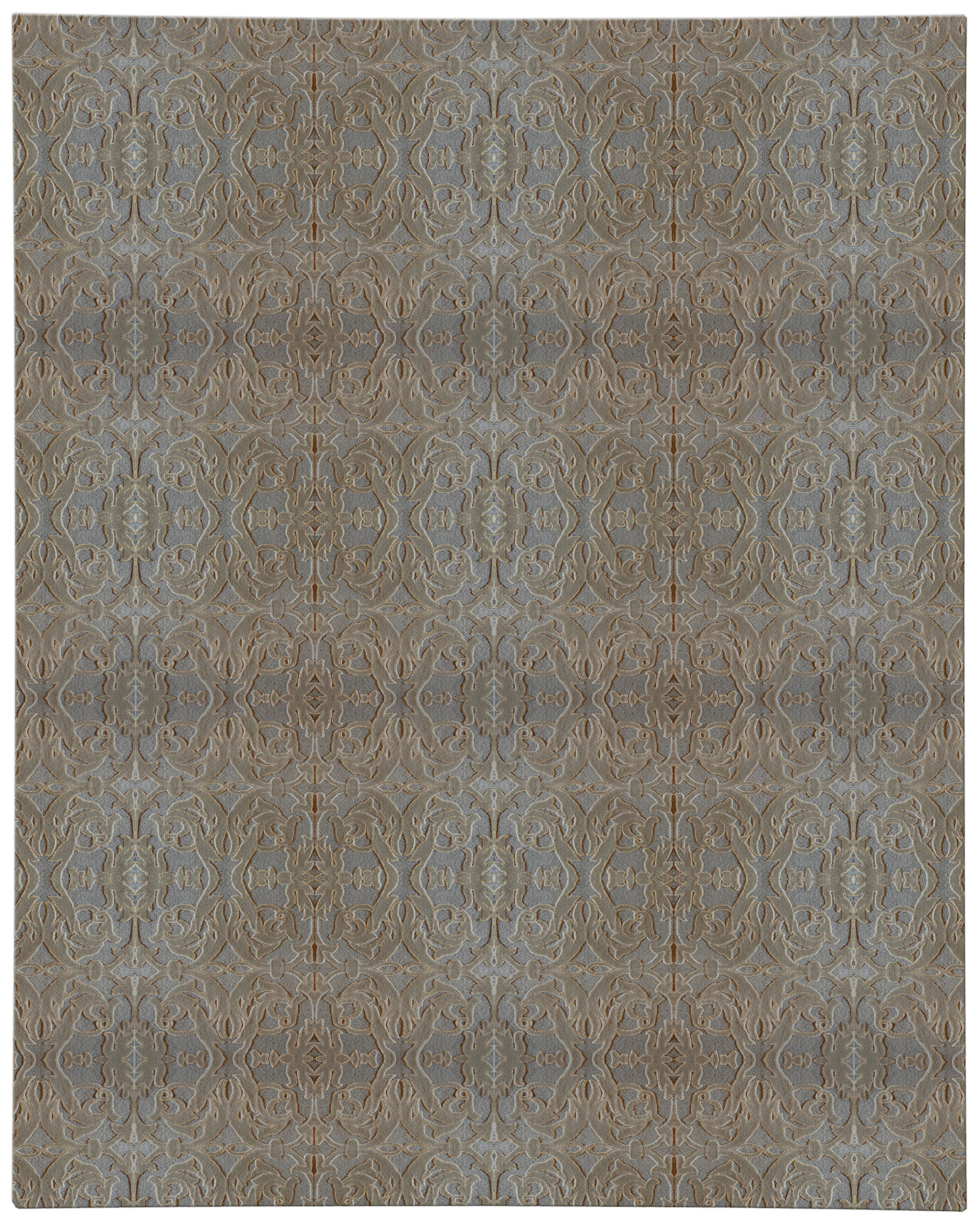
Natural dyes are often chosen for their depth, softness, and subtle movement across the pile, but their real value becomes clearest over time. In custom rugs, especially those intended for serious interiors, the question is not simply whether the color looks beautiful on day one; it is how that color will behave under daylight, under furniture, and beside the other materials in the room. A well-chosen natural palette can feel calm and dimensional in a way that synthetic color sometimes cannot. Understanding that behavior helps buyers specify rugs with more confidence and fewer surprises.
Natural dyes—often called vegetable dyes in design conversations, though the category can be broader than plant-based color alone—tend to produce hues with visual depth rather than a single flat note. That depth comes from how dye molecules interact with fiber, how the yarn absorbs color unevenly at a microscopic level, and how hand-dyeing introduces small shifts from skein to skein. On a handmade rug, especially one that is hand-knotted, those shifts are part of the appeal because they create a surface that changes with viewing angle and light. The result is not inconsistency in the pejorative sense; it is a controlled irregularity that gives the rug presence without loudness.
For designers specifying custom rugs, this matters because color does not live in isolation. A muted indigo may read nearly charcoal in a north-facing room, while the same shade can open into blue-violet beside warm oak, plaster walls, or brass accents. A madder red may feel earthy against antique walnut but more formal against lacquer or polished stone. Natural dye palettes reward careful pairing because they are responsive rather than fixed, and that responsiveness can help the rug bridge old and new furnishings with less effort than a highly saturated, uniform synthetic color.
Why natural dye color feels rich and varied
The visual richness of natural dyes comes from layering. Many traditional dye recipes produce color through multiple baths, over-dyeing, or the blending of neighboring tones rather than one perfectly standardized shade. That means a wool warp may take one nuance and a weft another, while the pile catches light differently depending on fiber twist and knot density. In a finished rug, those variations can create a sense of depth that is especially noticeable in larger fields of color where the eye has room to read subtleties. This is one reason natural color often feels more architectural than decorative.
Fiber also plays a large role. Wool, with its scales and natural lanolin, tends to accept dye with a soft luminosity, while silk can sharpen the color and give it a reflective edge. On hand-knotted rugs, the interplay of wool and silk can be used deliberately to control emphasis, especially in borders, medallions, or patterned repeats that need to remain legible across a room. Even when the palette is restrained, the rug can still feel alive because the surface is never completely static. That is especially valuable in interiors built on quiet luxury and restraint, where texture often has to do the work that ornament used to perform.
There is also a practical reason designers continue to favor natural palettes in custom carpets: they are easier to coordinate across materials with different reflectance. Stone, limewash, timber, velvet, linen, and leather all respond differently to light, and a rug with softly varied color can mediate among them. Instead of competing with every surrounding finish, it can sit in the room as a visual middle ground. That makes natural dye rugs useful in spaces where the architecture is strong and the furnishing program is layered, because the floor covering can support the composition rather than overpower it.
How aging and light response shape rug patina
No rug remains visually identical to the day it is installed, and that is not a flaw. Over time, natural dyes may shift slightly in tone, darken in protected areas, or soften where sun exposure is more direct, creating a rug patina that many collectors and designers value. This aging is usually gradual, and in well-made pieces it often reads as mellowing rather than deterioration. The effect can be especially elegant on custom rugs intended for long-term interiors, because the color acquires a lived-in complexity that cannot be manufactured by formula alone.
Light is the main variable to watch. Ultraviolet exposure can affect any dye system, but natural dyes may show change in a more nuanced, layered way because the color is already composed of tonal variation. Near a window, the rug may lighten first in the exposed field while areas beneath seating or a table retain more saturated color, which can produce a readable contrast across the plan. For some interiors, that is a benefit; for others, it is a reason to rotate the rug periodically, use window treatments, or place the piece where sunlight is moderated. A serious buyer should think about light exposure before choosing the final palette, just as they would consider pile height or fiber content.
Aging also depends on use. In a circulation-heavy entry or family room, the pile can abrade in the pathways, especially if the rug has a lower cut pile or a finer weave. That wear does not affect every dye style equally, because some pigments reveal abrading more readily than others, and some dark shades show contrast as the pile changes direction. In quieter rooms, however, the age pattern may be almost entirely about light and cleaning, not foot traffic. This is why a room-by-room approach matters when specifying made-to-order rugs: the same color story can behave very differently in a breakfast room, a library, and a formal sitting area.
What to expect from tone over time
- Deeper, uneven shading within the field, especially on hand-dyed wool.
- Softening at the surface where the pile receives daylight or regular use.
- Clearer contrast between protected and exposed zones in bright rooms.
- A more nuanced overall color read as the rug develops age and character.
Matching natural-dye rugs with antiques and contemporary pieces
Natural-dye rugs are unusually adaptable in mixed interiors because they can converse with both antique and contemporary furniture without looking overly literal. In an antique setting, the soft irregularities of the color can echo aged wood, oxidized metal, and hand-finished upholstery in a way that feels historically grounded. In a more contemporary room, the same rug can temper sharper geometries and high-contrast finishes, keeping the composition from becoming visually brittle. The key is not matching era to era, but matching the visual temperature of the materials.
Consider a room with a nineteenth-century console, a modern sectional, and a low travertine table. A rug in a naturally dyed wool ground with a restrained border can anchor all three because its surface carries enough nuance to support antique detail while remaining calm beneath contemporary silhouettes. If the room already has strong pattern or sculptural furniture, a lower-contrast palette may be the better move; if the furnishings are plain, the rug can supply the room’s structural interest through color variation and pattern density. This is where custom rug design becomes useful, because dimensions, border width, and palette can be tuned to the exact balance of the room.
Scale and proportion also matter more than many buyers realize. A natural-dye rug with a complex field pattern may feel too busy if it is undersized, because the design has no room to breathe; the same pattern in the correct dimensions can read as disciplined and expensive. That is one reason designers often pair natural color with careful sizing decisions rather than treating color as the only variable. For rooms that require exacting layout decisions, a custom rugs consultation can help align palette, proportion, and furniture placement so the rug feels integrated rather than incidental.
In open-plan interiors, natural palettes can also help zone the space without making the floor look chopped up. A rug with mild tonal movement can delineate dining and seating areas while preserving visual continuity through the whole room. This is especially effective when the rug sits beneath mixed materials such as oak chairs, a marble dining top, and linen upholstery, all of which benefit from a floor covering that does not fight for attention. The result is a room that feels composed from every angle, including the long sightlines that often expose weak rug choices immediately.
Selection notes for serious buyers
When evaluating natural dyes, start with the room’s light conditions before you fall in love with a single swatch. Morning light, afternoon sun, and artificial evening light can each alter the reading of a natural palette, sometimes dramatically. If possible, compare the color against the actual wall finish, floor material, and upholstery samples rather than against a neutral backdrop. A beige that feels warm in the showroom may turn dusty or pink at home, while a green that seems subdued in a sample can become dominant in a room with reflective stone or glossy millwork.
Construction should be reviewed at the same time as color. Hand-knotted rugs, for example, offer the most controlled opportunity for nuanced dye expression because the knotting structure preserves detail and gives the surface a refined hand. Pile height changes the way the dye reads as well: a dense, shorter pile can make color appear slightly more compressed and formal, while a taller pile may soften contrast and amplify texture. If the room is highly trafficked, durability and maintenance need to sit alongside aesthetics, because a beautiful natural palette is only as successful as the way it performs under daily use.
Buyers should also think about the broader interior narrative. Natural dyes are often selected for rooms that already contain a lot of material intelligence: antique metal, handmade ceramics, paneled walls, plaster, or richly grained wood. In those settings, the rug does not need to shout; it needs to hold its own. A thoughtfully specified rug can carry enough character to feel collected without becoming dated, which is useful for homeowners and designers seeking long-term value rather than momentary impact. That balance is one reason natural color remains a trusted option in serious rug libraries.
If you are evaluating options for a formal living room, library, or principal bedroom, ask how the rug will age in relation to the rest of the scheme. Some interiors benefit from a slow-developing patina that adds depth year by year, while others need a more stable color profile because the room relies on precision and tonal control. Neither choice is inherently better. What matters is whether the dye behavior supports the architectural intent, the furnishing plan, and the way the room will actually be used.
FAQ
Do natural dyes always fade faster?
Not necessarily. All dyes respond to light and use, but natural dyes can age in a softer, more layered way that many people interpret as desirable rug patina rather than obvious fading. The real outcome depends on fiber, construction, sun exposure, and how much traffic the rug receives. In a protected room with thoughtful placement, a natural-dye rug can hold its character very well over time.
Why do natural dyes look so alive?
They often contain slight tonal variation that the eye reads as depth. Because vegetable dyes and other natural color systems may absorb unevenly across fiber, the surface reflects light in subtle shifts instead of one flat note. On handmade rugs, that complexity becomes more visible as the pile moves and the viewing angle changes.
How should I care for a natural-dye rug?
Keep it out of prolonged direct sun when possible, rotate it if one side receives more light, and use a cleaning approach suited to the fiber and construction. Gentle maintenance matters more than aggressive intervention, especially with wool and silk rugs. If the rug is custom-made, ask for care guidance specific to the weave, pile height, and intended room use.
Are natural dyes a good choice for family rooms?
Yes, provided the rug construction and palette are chosen realistically for the room. A denser weave and a medium-value color can make day-to-day life easier while still giving you the nuanced look that natural dyes are known for. In active rooms, it helps to prioritize durability, soil visibility, and the way the color will age in pathways.
For buyers comparing materials, drawings, and room conditions, Doris Leslie Blau approaches natural color the way a designer does: as part of a larger composition, not an isolated feature. If you are weighing a palette for a specific interior, specialist guidance can help translate beauty into the right scale, construction, and light response so the rug feels considered from the start and remains compelling as it ages.