

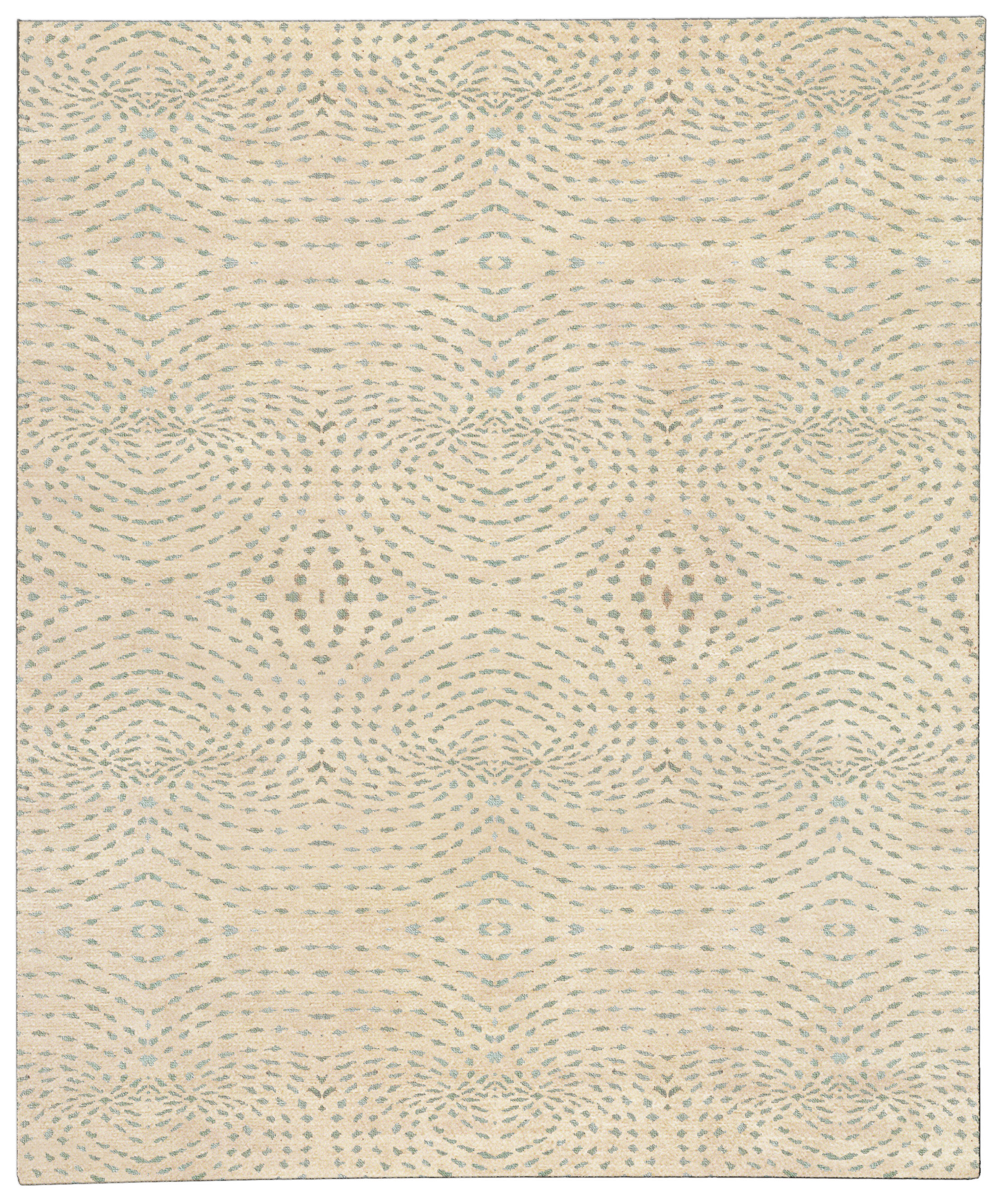
Custom rugs in softened blue-green shades can do something that plain neutrals often cannot: they calm a room without draining it of personality. When the palette is handled with restraint, muted blues and greens bring atmosphere, depth, and a subtle shift in temperature that feels composed rather than decorative. The result is especially useful in interiors that need serenity but still have enough architecture, furniture, or art to deserve a more nuanced foundation.
There is a reason subdued blue-green carpets keep appearing in well-edited rooms. These colors sit between cool and warm in a way that reads quietly sophisticated, so they can soften hard edges, temper strong wood tones, and support both traditional and contemporary furniture without fighting for attention. Unlike brighter teal or saturated emerald, the muted range lets material quality, proportion, and light do more of the work. That makes it a particularly strong choice for clients who want a floor covering that feels intentional but not loud.
Explain why muted blue and green combinations work so well
Blue and green share a visual language that feels natural to the eye, but the real strength of the combination lies in restraint. When the hues are softened with gray, smoke, olive, or denim undertones, they stop reading as overtly “colorful” and begin functioning as atmosphere. This is why muted blues and greens can feel calm in a way that still holds interest: the eye notices variation in depth, not just hue. In a large room, that subtle movement can keep the floor from looking flat.
Designers often turn to this palette when a room needs to feel settled but not severe. A pale sage under a weathered oak table, a slate blue in a library with leather seating, or a mineral green in a bedroom with limestone walls each carries a different emotional register, yet all stay disciplined. The key is that these rugs create visual temperature rather than visual noise. They bridge materials, help furniture read as a group, and preserve a sense of air.
This is also why the palette is useful in transformative teal interiors, where the goal is not to splash teal everywhere but to use it as an organizing tone. A floor covering in a muted teal family can become the room’s quiet anchor, supporting brass, walnut, plaster, and stone without flattening them. In that context, the color is not a trend gesture; it is a design tool. The rug gives the room a controlled pulse.
Use undertone to keep palettes sophisticated
Undertone matters more than the label attached to a color. Two rugs may both be described as blue-green, yet one can feel coastal and casual while the other reads tailored and architectural. The difference is usually in the undertone: a touch of gray cools the palette, brown softens it, and a slight blackened cast gives it gravity. If you want the room to feel mature, look for colors that seem filtered rather than fresh from the dye vat.
Tonal rugs are especially effective here because they let the undertones do the talking. Instead of relying on high-contrast pattern, a tonal field may shift through barely perceptible layers of celadon, fog blue, moss, or deep juniper. That kind of subtle gradation works beautifully in rooms with strong millwork, art walls, or sculptural furnishings, where the floor should support the composition rather than compete with it. It also makes the rug easier to live with over time, because the palette feels settled instead of seasonal.
Construction affects how undertone is read. A hand-knotted wool rug will usually diffuse color in a softer, more dimensional way than a flatter construction, especially when the yarns are hand-spun or lightly abrash. Silk accents can add a change in reflectivity that makes a muted shade feel richer in low light, while a wool-and-silk blend can keep the surface from looking too matte. If the room is primarily daylit, that variation is useful because it keeps the rug from disappearing under bright exposure.
Discuss where a cooler rug can balance warm wood and stone
Cooler rugs are often at their best when they are asked to mediate between warm, tactile materials. Honey oak, walnut, travertine, and limestone all carry their own temperature, and a blue-green ground can keep those elements from feeling overly earthy or heavy. In a room with a generous amount of wood, a muted blue-green rug provides relief without introducing a stark contrast. It can make the furniture read as more tailored and the architecture as more precise.
Stone presents a slightly different challenge. Large expanses of limestone or pale marble can feel elegant, but without a grounding layer they may drift toward sterile. A cooler rug in a smoky sea-glass range can introduce depth and make the floor plane feel intentional, especially in open-plan spaces where boundaries are not clearly defined. This is where scale and proportion matter: the rug should be large enough to frame the furniture grouping, otherwise the color will appear isolated rather than integrated.
For homes that use a great deal of wood and stone together, the most effective approach is often a rug that leans neither obviously blue nor obviously green. That in-between quality can be more versatile than a pure hue, because it picks up the gray in stone and the warmth in timber at the same time. In practical terms, that means fewer fights with upholstery, millwork stain, or artwork frames. A well-chosen custom rug can quiet the transition between materials and make the room feel considered from the ground up.
For rooms with unusual dimensions or difficult furniture layouts, custom rug design is often the cleanest solution because color, size, and edge treatment can all be resolved together. A made-to-order piece can be tailored to the exact seating arrangement, the width of a fireplace wall, or the geometry of a long gallery hall. That avoids the common mistake of choosing a beautiful color in a size that forces awkward borders or interrupts circulation. In a disciplined interior, those details matter as much as the palette itself.
Offer room-specific color pairing examples
In a living room, a muted blue-green rug can be paired with camel leather, walnut casegoods, and linen upholstery for a look that feels grounded but not heavy. If the walls are off-white, the rug adds enough chromatic interest to keep the room from going blank, while the furniture remains the primary focus. A low-contrast pattern can be useful here, especially if the seating is modular or the architecture is simple. The rug should define the conversation area without turning it into a stage set.
In a bedroom, the same palette can behave more softly. A dusty green with blue undertones works well against pale oak, brushed nickel, or plaster walls because it lowers the visual volume of the room. Pile height becomes more relevant in this setting: a slightly plusher hand-knotted rug can introduce quiet comfort underfoot and deepen the sense of rest. If the bed is upholstered in a warm fabric, the cool rug prevents the room from becoming too sweet or monochromatic.
Dining rooms benefit from muted blue-green rugs when the table and chairs are doing most of the visual work. Here, the rug should be strong enough to hold the room together but restrained enough not to compete with chair legs, lighting, or tableware. A subtly patterned field can be particularly effective beneath a rectangular table because it introduces rhythm without making the setting feel busy. If the room opens to a kitchen or breakfast area, the cooler palette also helps distinguish the dining zone from warmer, more utilitarian surfaces nearby.
In a study or library, these colors can feel especially apt because they pair naturally with dark wood, aged leather, and metal finishes. A deeper slate-green or ink-blue rug can anchor heavier furniture and absorb some of the acoustics that make workrooms feel hard. If the room has art on the walls, a quieter floor allows the eye to travel upward without distraction. This is one of the places where custom rugs really prove their value: they can be proportioned to the room’s working life, not just its footprint.
Choose pattern density with the room’s architecture in mind
Muted color does not have to mean visual emptiness. The question is how much pattern the room can support without losing its calm. In a room with strong moldings, paneled walls, or prominent built-ins, a low-density pattern may be enough to provide movement. In a more minimal interior, the rug can carry a little more texture or abrash because the architecture is doing less of the decorative work.
Pattern density should also respond to sightlines. If the rug is visible from several adjacent spaces, a highly specific motif may feel too insistent, especially in a blue-green range that already has presence. By contrast, a tonal field with shifting pile direction or subtle border modulation can read as elegant from across the room and still reward closer inspection. This approach is particularly effective in open-plan homes where the rug is expected to organize space without becoming the only decorative event.
Material choice reinforces that effect. Wool offers resilience and a natural softness of color; silk introduces sheen and precision; blended constructions can balance both. For families, hospitality settings, or heavily used living rooms, the practical advantages of durable wool construction often outweigh the appeal of more delicate fibers. A beautiful palette only succeeds when the construction supports how the room is actually lived in.
Think about light, not just color chips
Muted blue and green rugs can look dramatically different depending on exposure. North-facing light tends to bring out the cooler, grayer side of the palette, which is ideal if you want a room to feel crisp and composed. South-facing light can warm the same rug and make the green read more softly, especially if the surrounding finishes are already golden. Evening light may emphasize the deeper undertones, which is useful in rooms designed for entertaining or quiet reading.
That is why samples should be reviewed where the rug will actually live. A color that appears subdued in a showroom may seem greener, bluer, or more contrasted once it is placed next to upholstery, wall color, and flooring. In a carefully designed space, this is not a problem; it is part of the design process. The most successful rugs are usually the ones that look composed under changing conditions, not only under perfect light.
For clients who want lasting flexibility, a slightly weathered or mineralized version of the palette tends to age better than something too crisp. It coordinates more readily with future furniture changes, art rotations, and seasonal textiles. That is one reason custom rugs can be such a sound investment: the color can be tuned to the room’s larger architecture rather than to a fleeting idea of trend. The result is a floor covering that feels current without being dependent on novelty.
How to specify a muted blue-green rug with confidence
- Match undertone to the dominant finish in the room, whether that is warm oak, cool stone, plaster, or metal.
- Confirm rug size against the furniture plan so the color field frames the layout instead of floating inside it.
- Choose pile and fiber based on how much light, traffic, and maintenance the room will receive.
- Decide whether the room needs a tonal surface or a quieter motif to create rhythm.
- Review color in situ at different times of day before finalizing a custom or made-to-order piece.
For homeowners and designers who want a room to feel serene without becoming bland, muted blue-green rugs offer a remarkably flexible answer. They can sharpen a room’s composition, soften hard materials, and create a color story that feels controlled rather than decorative for decoration’s sake. The best versions are not just pretty surfaces; they are structural elements that help the interior make sense. That is exactly where Doris Leslie Blau’s expertise in rugs, proportion, and material nuance becomes valuable.
FAQ
What makes blue-green rugs feel mature rather than coastal?
Maturity usually comes from undertone, saturation, and finish rather than from the hue itself. When blue-green is muted with gray, black, or a mineral cast, it loses the fresh, literal quality associated with coastal decor. Pairing the rug with refined materials such as walnut, limestone, leather, or brushed metal also shifts the reading away from theme and toward architecture.
Can muted colors still be interesting?
Yes, especially when interest comes from texture, abrash, weave detail, or tonal variation rather than bold contrast. A subdued rug can reveal depth as the light changes, which often feels more sophisticated than an overt pattern. In many rooms, that quiet complexity is what allows the rest of the interior to feel resolved.
How do I choose the right depth of color?
Start with the room’s function, light, and surrounding materials. Lighter muted blues and greens can keep smaller rooms open, while deeper, smoky versions work well in larger spaces or rooms with substantial furniture. If the room already has a lot of visual activity, a softer depth usually performs better; if the architecture is minimal, a slightly richer tone can provide needed grounding.
Are tonal rugs better than patterned rugs in this color family?
Not always, but tonal rugs are often the safer choice when the room already has strong furniture forms, artwork, or architectural detail. A subtle tonal surface can add movement without adding another layer of pattern. If the space is otherwise restrained, a low-contrast pattern may bring just enough rhythm to keep the composition from feeling too static.
If you are refining a room that needs calm, character, and a more tailored palette, a specialist can help you translate those goals into the right construction, size, and shade. Doris Leslie Blau’s gallery expertise can guide the process from first color direction to a rug that sits naturally within the architecture of the space.