

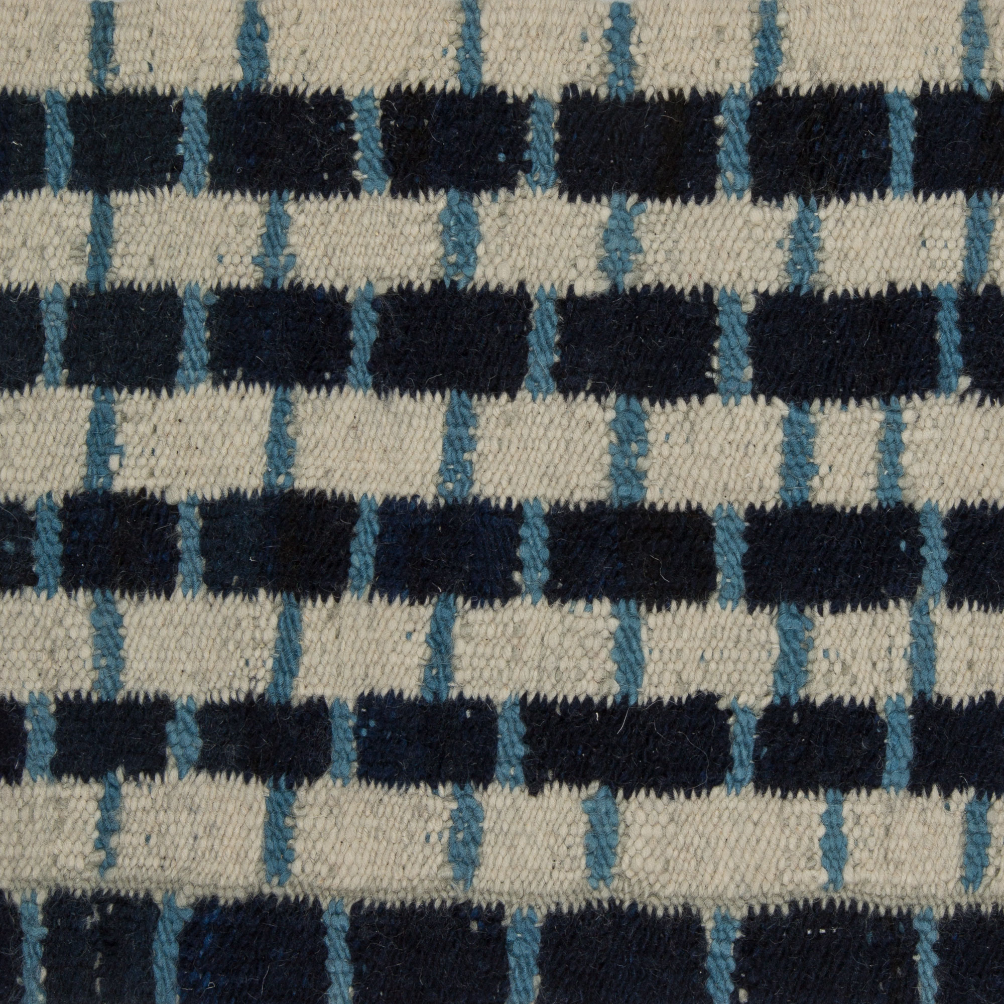
Natural dyes have a way of giving custom rugs a visual depth that feels composed rather than manufactured. Their color is rarely flat; it shifts with light, pile direction, and the surrounding materials, which is why designers often choose them when a room needs warmth, nuance, and a more layered presence. For buyers considering natural dyes, the real question is not only how the palette looks on day one, but how it will live with the interior over years of use.
Natural dye color is shaped by the ingredients behind it, the fiber it enters, and the hands that apply it. Vegetable dyes and other traditional dye sources do not produce the same uniformly saturated result you might expect from a synthetic formulation, and that variation is precisely what gives the surface character. In a well-made rug, some yarns may hold color a touch more deeply than others, creating a subtle striation or abrash effect that reads as visual movement rather than inconsistency. For interiors that rely on texture, patina, and restraint, that kind of complexity can be a major design asset.
Why natural dye color can feel rich and varied
Natural dyes interact with wool, silk, and other fibers in a way that can produce tonal shifts within a single field of color. A blue might lean slate in one area and a little greener in another; a red may read as rust in low light and wine-toned near a window. That variation is not a defect. It is often the very reason designers specify hand-knotted rugs with natural coloration, because the eye perceives depth, movement, and softness that machine-perfect color can flatten. In a room with stone, wood, lacquer, or aged metal, those changing tones help the rug relate to multiple finishes at once.
The best way to understand this effect is to think about surface instead of only hue. A natural-dye rug can carry color across the pile with a felted richness that seems to absorb and reflect light at the same time. Wool pile tends to soften the palette, while silk accents or a higher knot density can make the coloration appear more luminous and crisp. For clients who want custom rugs that feel collected rather than sterile, that balance of tonal variation and tactile precision is often more persuasive than a perfectly even color block.
Pattern also changes the way natural dyes are read. In a dense pattern, the eye registers the movement as part of the ornament, which can make the rug feel especially alive. In a quieter field, the same irregularity becomes more visible and more important, creating what many designers call a calm vibrancy. This is useful in interiors that need personality without visual noise, especially where furniture is sculptural or architectural details already carry a lot of weight.
How aging and light response shape rug patina
One of the most appealing qualities of natural dyes is the way they age into the room. Over time, light exposure, traffic, and cleaning patterns can slightly soften the intensity of the color, producing a rug patina that feels integrated with its surroundings. In the right setting, this gradual change is not a loss of value to the eye; it is part of the rug’s slow development. Many collectors and designers appreciate this because the surface becomes less declarative and more atmospheric as the years pass.
Light response matters, though, and it should be considered with the same seriousness as scale or pile height. Direct sunlight can affect any dyed textile, but natural dyes may show their aging in a more nuanced way, with some pigments mellowing faster than others. A deep green may soften toward olive, a madder-based red may move toward brick, and darker neutrals can gain a dusty softness. Rather than thinking of this as a simple fade, it helps to view it as a shift in chroma and contrast, which can be especially attractive in interiors designed around antique wood, plaster, or honed stone.
Placement is the practical answer. If a rug will sit beneath a large south-facing window, you may want to think about curtains, UV-filtering glass, or a rotated layout that evens out exposure over time. In a more diffuse-light setting, natural dyes often age very gracefully, especially when the room’s palette already includes organic materials and subdued finishes. Buyers comparing hand-knotted rugs should ask not only how the colors look in the showroom, but how they may behave in the specific light of a living room, library, or dining space.
When natural dyes support antiques and contemporary pieces
Natural dyes are especially effective in rooms where antique and contemporary pieces need to coexist without competing. An older chest of drawers, a modern sofa, and a spare brass light can look oddly disconnected if the rug is too hard-edged or colorless. A rug with natural dye variation can bridge those differences because it carries a sense of age and handcraft while still reading cleanly in a contemporary plan. This is one reason they work so well in layered interiors that depend on contrast rather than matchy coordination.
In antique settings, a natural-dye rug can echo the softened edges of old wood, worn leather, and oxidized metal without appearing overly literal. In contemporary rooms, the same rug can temper harder surfaces like glass, polished plaster, or steel by introducing warmth and tonal complexity. If the furniture layout is open-plan, the rug can also become a quiet zoning tool, defining a seating area without drawing a harsh boundary. That is particularly effective when the color palette needs to shift across adjacent functions, such as dining to living or entry to lounge.
Scale and proportion are critical here. A rug with a nuanced natural palette needs enough visual field to breathe; if it is undersized, the color complexity may feel cramped under furniture and lose its composure. In a larger room, the pattern or field can absorb more light and reveal more variation, which is often what gives the piece its authority. Designers selecting custom rugs for mixed-era interiors frequently use that breathing room to let the textile function as a connector rather than a focal interruption.
Materials, construction, and why they matter for color behavior
The same dye formula can behave differently depending on fiber and construction. Wool remains the most responsive and forgiving foundation for natural dyes because its structure accepts color with depth and softness, especially in hand-knotted rugs where each yarn can be carefully controlled. Silk, by contrast, tends to reflect more light and can make the same hue appear sharper or more saturated. Blends and mixed textures can be useful, but they require careful specification so the final surface does not read as visually uneven in an unintended way.
Knotting style and pile height influence the way color is seen from across the room. A shorter pile can present the palette with greater clarity, making tonal shifts and abrash more apparent. A deeper pile softens edges and can make the dye response feel velvety, which is useful when the room needs a quieter mood. This is where a thoughtful made-to-order process matters: the same color family can be tailored to feel crisp, subdued, or richly dimensional depending on how the rug is built.
For serious buyers, this is where material decisions become inseparable from design intent. If the rug is meant to anchor a formal sitting room, a more controlled weave and a restrained palette may suit the architecture. If it is intended for an intimate library or bedroom, a warmer wool surface with natural dye variation may create the right softness underfoot and in view. When clients ask for custom carpets, the conversation should include not just color selection, but texture, luster, and how the rug will register at the exact distance from which it is most often seen.
Selection notes for serious buyers
Choosing a natural-dye rug begins with the room, not the swatch. Look at flooring, upholstery, wall color, and the amount of daylight the room receives throughout the day. A pigment that feels restrained in the showroom can appear far more animated in a sunlit interior, while the same color may feel subdued in a north-facing room. Bringing samples into the actual space is useful because natural dyes often reveal subtle undertones that are invisible under artificial light or against a neutral wall.
It also helps to decide how much character you want the rug to carry. Some interiors benefit from a field with visible movement and a pronounced rug patina from the start, especially if the furnishings are crisp or the architecture is minimal. Others need a more measured effect, where the natural variation is present but understated. That choice affects pattern density, dye saturation, and even whether the rug should read as a quiet foundation or as the room’s most textured object.
For buyers comparing options, a useful question is whether the rug should coordinate with existing antiques or provide contrast against contemporary furniture. If the room already has a lot of visual activity, a gentler palette may be the right answer. If the architecture is simple and the furnishings are tailored, a more expressive natural-dye surface can bring depth without clutter. When needed, a specialist can help translate those priorities into custom rugs that fit the room’s proportions, material palette, and long-term use.
Durability should also be part of the specification conversation. Natural dyes do not automatically mean fragile rugs, and they do not automatically mean high maintenance, but they do reward informed placement and routine care. For a family room, one may choose a denser weave and a palette that can gracefully absorb the evidence of daily life. For a formal salon or master bedroom, the priority may be color nuance and tactile refinement. The point is to align the dye story with the actual rhythm of the interior.
How to think about care without overcomplicating it
Good care begins with consistency. Regular vacuuming, prompt attention to spills, and occasional rotation help preserve both the fiber and the appearance of natural-dye color. Because these rugs are often prized for their tonal complexity, heavy spot-cleaning or aggressive chemical treatment can alter the surface more abruptly than the slow changes of ordinary use. For that reason, it is wise to treat the rug as a crafted textile rather than a disposable floor covering.
It is also sensible to coordinate cleaning methods with the fiber and weave. A wool rug with natural dyes may tolerate routine maintenance very well, but the exact approach should reflect the construction and the level of household traffic. In rooms with pets or frequent guests, a denser hand-knotted structure is often easier to live with because it masks minor wear more elegantly. The goal is not to avoid patina altogether; it is to encourage a graceful one.
A practical example of how the palette works in a room
Consider a living room with a pale limestone floor, a low walnut sofa, and a pair of blackened steel tables. A synthetically uniform rug in the wrong color might feel too rigid between those materials, while an overly ornate antique could tip the room into visual competition. A custom rug with natural dyes in muted sienna, soft olive, and worn indigo could bridge the warm and cool elements at once. The color would not need to match any single object; instead, its tonal shifts would allow the room to settle into a more coherent rhythm.
In that setting, the rug’s patina would not be an accessory detail. It would become part of the composition, especially as daylight moves across the surface and changes the read of the hues. If the room is designed for conversation, the rug can soften acoustics as well as sightlines, making the space feel composed without becoming formal. This is often the difference between a room that looks styled and a room that feels genuinely lived in.
FAQ
Do natural dyes always fade faster?
Not always. Natural dyes can change with light exposure, but the rate and quality of that change depend on the fiber, the dye source, the construction, and where the rug is placed. In some interiors, the color softens gracefully rather than fading in a noticeable or damaging way. With proper placement and care, the aging can be a visual advantage rather than a drawback.
Why do natural dyes look so alive?
They rarely produce a perfectly uniform surface, and that variation gives the eye more to read. Small shifts in saturation, undertone, and light reflection create depth across the pile, which is especially visible in hand-knotted rugs. The result is a color that feels woven into the material rather than printed on top of it.
How should I care for a natural-dye rug?
Use routine vacuuming, rotate the rug when appropriate, and address spills promptly but gently. Avoid harsh cleaning methods that can disturb the color or the fiber. If the piece is large, valuable, or especially nuanced in tone, it is best to ask for care guidance tailored to the specific construction and placement.
Can natural dyes work in modern interiors?
Yes, especially when the architecture is restrained and the furniture has strong lines. A natural-dye rug can introduce warmth, depth, and a softer color register without compromising a contemporary scheme. It is often most effective when the room needs texture and tonal complexity rather than another hard-edged surface.
For interiors where color, scale, and material detail all need to work together, natural dyes offer a thoughtful way to build atmosphere without excess. If you are weighing a new piece for a room that asks for nuance, consider the conversation as part of the design process itself, and let a specialist help shape the right material and palette for the space.