

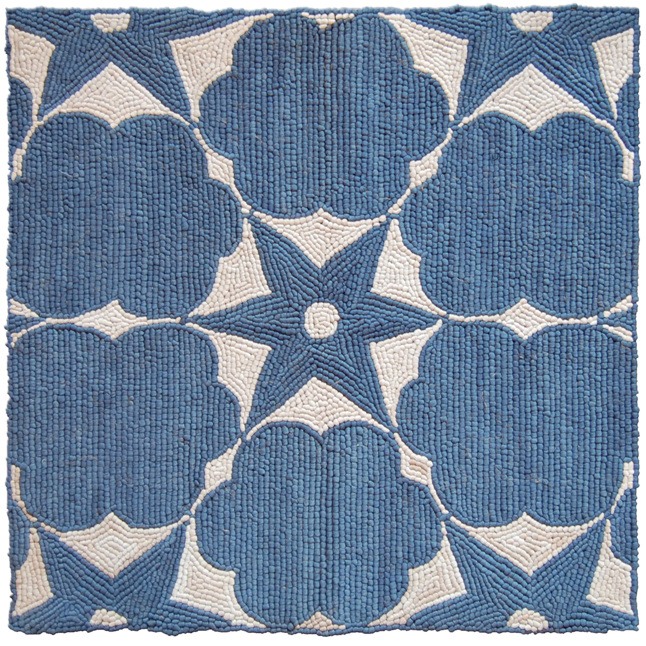
When presenting custom rugs to a client, the goal is not to show the most options; it is to show the right ones. A well-structured presentation helps the client compare scale, texture, and pattern without losing sight of the room’s architecture, furniture plan, and atmosphere. That is especially important when the project depends on designer custom rugs, because every selection sends a message about how the space will function. A clear rug presentation keeps the conversation on design decisions rather than on vague preferences.
For interior designers, rugs often carry more visual weight than clients expect. They anchor the seating arrangement, influence how large a room feels, and can either soften or sharpen the overall language of a scheme. If the presentation is handled casually, clients may focus on a color they like and overlook whether the rug actually works under the table, beside the sofa, or across a long axial room. A disciplined approach to the rug sampling process gives the client confidence and protects the design direction you have already established.
Select options that show different functions, not just different colors
One of the most effective strategies when choosing rugs for client presentations is to organize samples by design function. Instead of laying out three nearly identical rugs in slightly different neutrals, show a range that answers different spatial questions. One rug might test the strength of a border, another might clarify how much pattern the room can support, and a third might show whether a more textural ground can calm a busy architectural envelope. This approach gives the client a framework for comparison, which is especially helpful in rooms where the furniture, finishes, and lighting already create a lot of visual information.
Function-based selection is particularly useful in projects involving open-plan interiors or irregular rooms. A client may not know how to evaluate a rug in isolation, but they will immediately understand the difference between a piece that defines a dining zone and one that makes the seating area feel too loose. In some cases, the best comparison is between a rug that disappears quietly and one that gives the room an edge. In others, the real decision is whether the rug should support the architecture with symmetry or counter it with a softer, more organic layout.
A practical comparison set
- A low-contrast rug that supports furnishings and preserves a restrained palette
- A more patterned option that introduces rhythm without overwhelming the room
- A textured rug that changes the tactile character of the scheme
- A border-focused design that can frame furniture placement or architectural axes
Explain each sample in the context of the full room
Clients rarely make their best decisions when they are looking at a sample as if it were a piece of art. They need to see what the rug does inside the room. When presenting custom rugs, speak in terms of relationship: how the rug interacts with wall color, upholstery, floor finish, art placement, and daylight. A wool ground may look understated in isolation but provide exactly the quiet structure a room needs once it sits beneath velvet seating and a stone coffee table. A silk accent may feel subtle on a board, but in a sunlit room it can alter the entire tonal temperature of the scheme.
It helps to narrate each option with precise language. Instead of saying a rug is “warmer” or “more interesting,” explain whether it pulls in the wood notes, softens a high-contrast envelope, or creates a cleaner transition between adjacent zones. That kind of explanation supports the client’s visual understanding and reduces the chance that the conversation will drift toward personal taste alone. The more clearly you define the rug’s role, the easier it becomes for the client to choose with purpose rather than hesitation.
If you are working with hand-knotted rugs, construction details can be part of that explanation. A client does not need a technical lecture, but they do need to understand why hand craftsmanship matters when the rug must hold a large room together or deliver a precise motif at scale. Point out when the pile height affects the perceived softness of the scheme, when a denser weave will preserve a sharper border, or when a more open texture will feel too casual for a formal setting. These are the kinds of details that turn a sample into a design decision.
Use visuals to compare scale, texture, and border options
Scale is one of the hardest things for clients to judge from a small sample, which is why a visual comparison should always include the rug in context. Floor plans, elevation images, and well-marked furniture layouts help clients understand where the edges will fall under a sofa, how much floor will remain visible around a dining table, and whether the rug will support the room’s symmetry or expose imbalance. A rug that seems generous on a sample board can feel undersized once it is mapped onto a real seating arrangement. Clear visuals prevent that mistake before it is made.
Texture deserves the same treatment. The difference between a flat, tightly woven surface and a more tactile pile is not merely aesthetic; it changes how light moves across the room and how formal the setting reads. A room with polished plaster walls and crisp upholstery may benefit from a rug that adds visual softness, while a layered, collected interior may need a flatter ground to avoid too much texture competing at once. Showing the samples next to finish references, upholstery swatches, and lighting notes helps clients make this assessment with far greater accuracy.
Border options also deserve close attention because they often control the room’s visual structure. A border can extend the length of a narrow room, frame a conversation area, or subtly echo architectural trim. In some projects, a borderless design keeps the composition open and modern; in others, a defined edge gives the furnishings a stronger sense of placement. When you compare these choices visually, clients can see that the border is not a decorative afterthought but a structural part of the design.
For projects with highly specific dimensions, a custom rugs approach allows the design to respond to the room instead of forcing the room to adjust to a standard size. That is often the difference between a scheme that feels carefully composed and one that merely contains furniture.
Prevent decision fatigue during presentations
Too many nearly equal choices can exhaust a client before they reach a confident conclusion. Decision fatigue is especially common when all the samples share the same general palette, because the mind starts searching for differences that may not matter to the actual room. A better strategy is to structure the presentation in layers: begin with the most important design question, then narrow the field as soon as one option clearly addresses it. If the client is comparing material hand, prioritize that before color nuance. If the issue is zoning, start with the rug that best defines the furniture layout, not the one with the prettiest border.
It can also help to limit each presentation round to a manageable number of options. Three to five rugs is usually enough to establish contrast without turning the meeting into a catalog review. If a client needs reassurance, offer a safe choice and a directional choice, then explain what each one protects or advances in the scheme. A restrained presentation shows confidence and keeps attention on the design logic behind the selection.
When the project is more complex, the best next step may be a second-stage rug sampling process with refined options rather than one oversized initial reveal. That is often the right move when the room includes unusual architecture, mixed-use zoning, or significant material layering. Designers who use this method tend to arrive at stronger outcomes because the conversation becomes more specific at each stage. Clients also feel more secure when they can see that the process is leading them toward a resolved scheme rather than an endless set of alternatives.
How to frame rug choices so the room stays coherent
The most useful client presentations do not ask, “Which rug do you like best?” They ask, “Which rug best supports the room we are already building?” That shift is subtle but important. It keeps the client focused on proportion, circulation, and atmosphere rather than treating the rug as a separate decorative object. In a dining room, that may mean choosing the piece that correctly accommodates chair movement and table extension. In a living room, it may mean identifying the rug that visually connects the sofa group instead of leaving the arrangement floating in the space.
It is also worth reminding clients that rug choice affects long-term enjoyment, not just first impression. A striking pattern can look exciting in a presentation but feel noisy once the room is furnished and lived in. A quieter rug can seem understated on a sample board but become the element that allows furniture, art, and lighting to read with clarity. This is one reason designer custom rugs are often specified early in a project: they help set the tonal and spatial logic of the room before other decisions become fixed.
For clients who are undecided between restraint and expression, frame the choice around usage and durability rather than style labels. A family room, for example, may benefit from a rug that disguises wear and supports relaxed movement, while a more formal lounge may justify a finer weave or a more deliberate motif. The point is not to push every project toward the same answer, but to make sure the rug aligns with how the room will actually be experienced. That kind of clarity is what keeps a presentation from feeling decorative in the shallow sense.
Presenting custom rugs with confidence
Good rug presentations are edited, contextual, and specific. They show the client how each rug behaves inside the room, not just how it looks on its own. They also make room for material knowledge, because construction, pile, and proportion affect the success of the final scheme as much as color does. When a presentation is built around those principles, clients can compare options without losing sight of the larger design direction, and the project moves forward with fewer revisions.
For projects that require tailored dimensioning, material guidance, or a more exacting approach to scale and finish, Doris Leslie Blau can provide the kind of specialist support that helps the right rug feel inevitable. A thoughtful consultation, grounded in gallery expertise and made-to-order knowledge, can make the difference between a promising idea and a fully resolved room.
FAQ
How many rug options should I show a client?
Three to five is usually the sweet spot. That range offers enough contrast to clarify the design direction without overwhelming the client with too many near-duplicates. If the project is complex, you can always refine the selection in a second round once the strongest logic has emerged.
Should I present one safe choice and one bold choice?
Yes, that pairing can be very effective if both options still serve the room. The safer rug reassures the client that the scheme will remain balanced, while the bolder one tests whether the space can support more pattern, color, or contrast. The key is to explain what each option does for the architecture and furniture, not just how adventurous it feels.
What helps clients understand scale best?
Floor plans, furniture layouts, and images showing the rug in relation to key pieces are the most useful tools. Clients need to see how much floor the rug will cover, where the edges will land, and how it supports circulation. Marking dimensions directly on visuals also helps them move from guesswork to informed comparison.
How do I keep clients from focusing only on color?
Lead with function, proportion, and material behavior before discussing color nuance. When clients understand how a rug will frame the seating area, affect light, or soften the room acoustically, color becomes one part of a larger decision. That keeps the conversation grounded in the overall scheme.