Rectangles and Squares: Corners, Lines and Design
At an art fair last week, I saw a portrait of Dorothy from Wizard of Oz. I didn’t notice at first, but a second look revealed that Dorothy’s hair and features were entirely composed of squares and rectangles – she was a girl made of cubes, but an unmistakable one nonetheless. I didn’t buy it, but it struck me as an interesting statement on the post-modern, pop culture-focused, digitized reality we live in. On a related note, tattoos inked in pixilated-style are increasingly cropping up on my Pinterest feed.
As citizens of the industrialized, computerized world, the rectangle is the basic structure of our lives – it’s the shape of the homes and offices we inhabit, and it’s the shape of the smallest components (pixels) of the images that travel across the screens we stare into.
![]()
Our saturated exposure to this four-sided shape affects our perception in ways we aren’t even aware of. Take for instance this optical illusion:
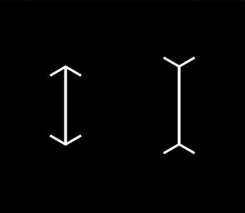
Which line is longer? Researchers discovered that typically Americans perceive the line with the ends pointed out as longer than the one with two arrowheads. This is because we live in spaces with linear construction, and that influences the way we perceive angles, i.e. this is how we usually perceive those lines:
The researchers discovered that members of a foraging tribe in Africa, who did not live in rectangular houses, were not fooled by the optical illusion, they could tell the lines were the same length because they hadn’t been normalized to rectangular design (here’s the full article on how culture shapes perception).
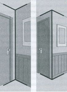
Once we take into account the impact rectangular environments have on our perception, we can factor it into our aesthetic choices. There’s comfort in the familiar, and there’s absolutely nothing wrong with that until it supersedes all other aspects of design and a space becomes predictable and tiresome.
In contemporary design, I see plenty of mistakes on both ends of the spectrum when linear composition isn’t properly considered: on the minimalist end, you get spaces that are too linear and wind up cold and austere; and on the other end you have places with too many elements, too many patterns and textures that make a space feel confusing and disorganized.
When it comes to composition, a room is like a painting: thinking about the basic linear and non-linear elements can help distill focus; and negative space is an important facet in determining the energy and flow of the finished product. There’s nothing wrong with embracing square geometry, so long as it’s set off by natural and organic elements.
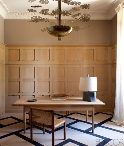
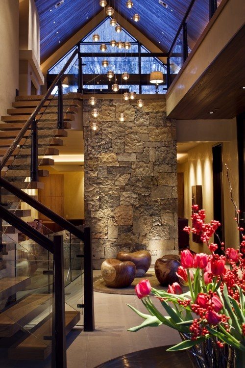
The pure lines of this office’s floors and walls are smartly complemented by a captivating light fixture with natural references (Are those flowers? Snowflakes?)
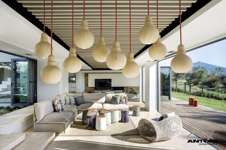
Here you have a room that is one long rectangle that includes a lot of clean lines, but then in contrast there are all these curvy wooden elements – topped off with wood light fixtures that look like light bulbs. I love the hyper awareness of this space, it’s a clever nod to the necessity of natural materials in our unnatural indoor spaces.
Thinking about organic and inorganic shapes starts with architecture and the structural foundation of a building, but it extends into the details and nuance of decorating.
Deciding how to coordinate and contrast all the lines and curves is both the beauty and the challenge of great design work. There’s no magic formula, but thinking about the essential shape of source materials and the interconnectedness of our environments – indoor and outdoor – can offer thematic depth to a statement.
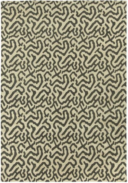
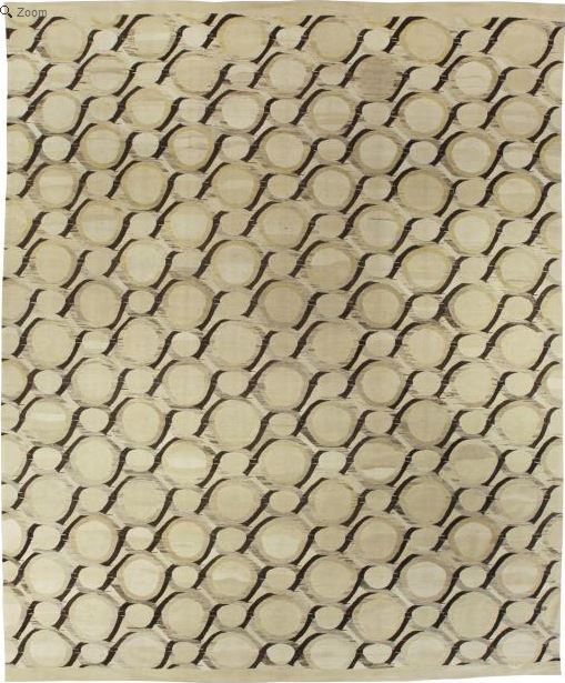
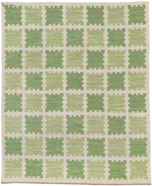
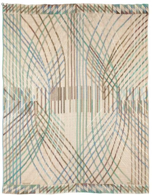
These four rugs are all from our collection, two from the vintage selection and two from the contemporary collection . Each has a unique essential line structure that would lend a different sensibility depending on what it was paired with.
Of course there are still a myriad of elements to think about besides lines, but distilling consideration to a single focus can shed new light on how we see a space and open us up to better informed choices.