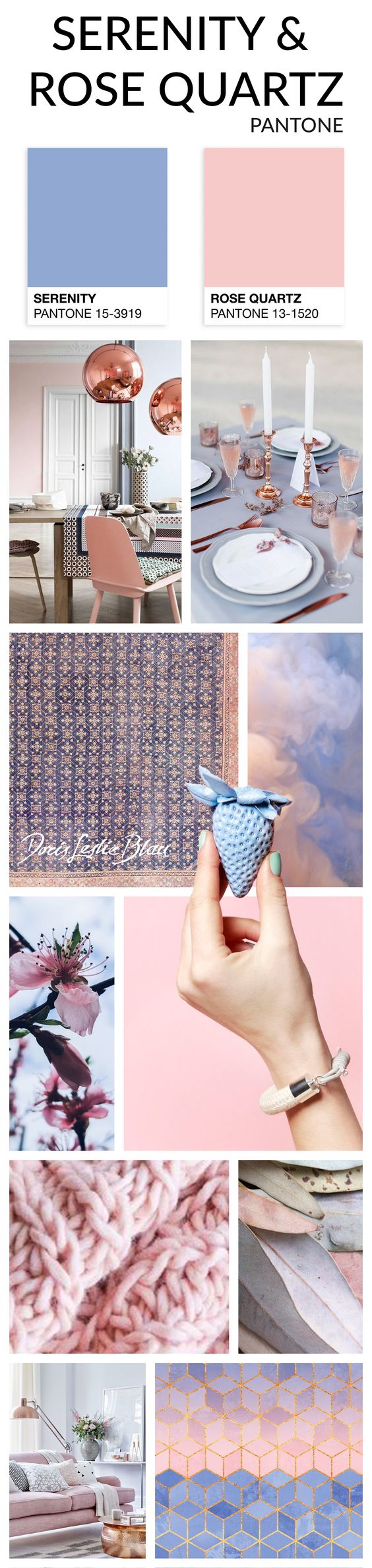
For the first time in history, the color trendsetter Pantone has selected not one, but two colors for the year 2016 – Rose Quartz and Serenity.
“Joined together, these colors demonstrate an inherent balance between a warmer embracing rose tone and the cooler tranquil blue, reflecting connection and wellness as well as a soothing sense of order and peace.” – says Leatrice Eiseman Executive Director, Pantone Color Institute. 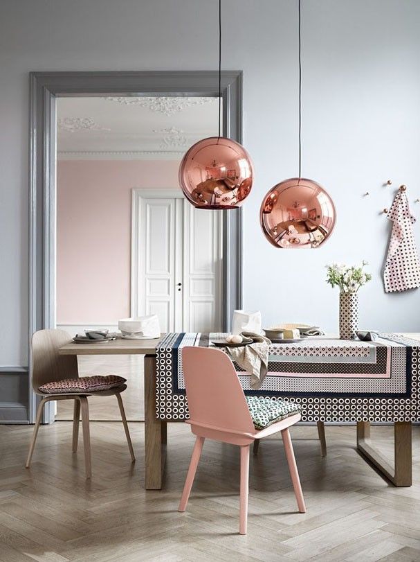
Careful merging of the two shades Rose Quartz and Serenity is apparent in this early 20th century North Indian Agra cotton rug, where the midnight blue field with diamond trellis in rose shades is embraced by the warm and soft flowery border. The two colors blend together flawlessly in a perfectly balanced work of art.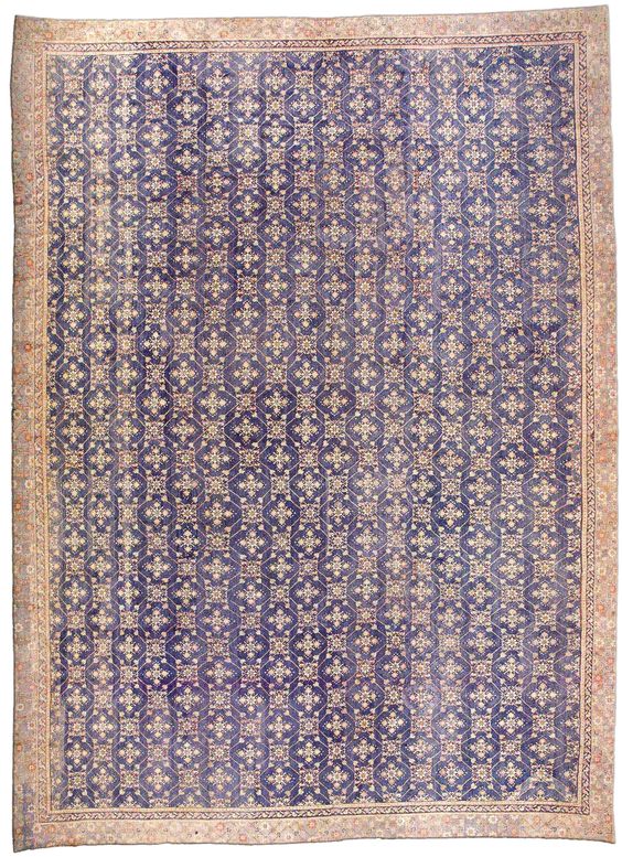
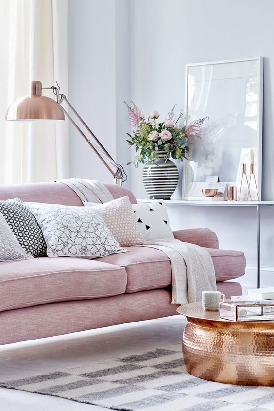
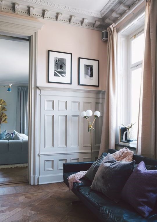
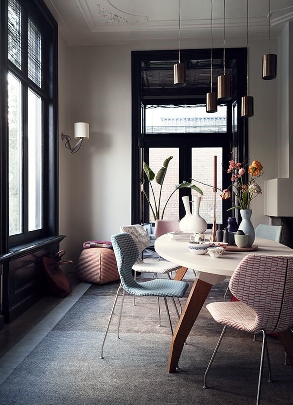
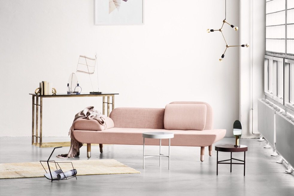
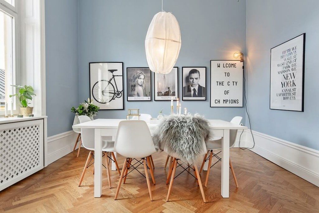
The two colors are meant to appear together providing the balance of elements, like it is with earth and air, warmth and calm, stability and unpredictability, permanence and change, sensuality and imagination – all opposing yet complementary. Rose Quartz and Serenity can easily be combined with colors such as gray, taupe, copper, green and more to create a calming effect of the interior, and simultaneously within the dweller. On the other hand the joyful aspect of these colors can add some lightness to a room that might otherwise be too rigorous or dull.
Pantone has made a strong political statement by highlighting societal movement toward gender equality and fluidity. The intent was to challenge traditional connotations associated with these two colors and support freedom of choice with using color as a form of expression. Let’s create balance in the environment and within ourselves in 2016 and the years to come!