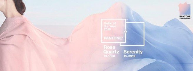
Pantone released its Color of the Year last week and made history by selecting not one, but two colors to represent the zeitgeist of 2016.
Intended to be coupled together, Rose Quartz, a warm rosy pink, and Serenity, a cool light blue, conjure images of nursery colors for many people. While Pantone’s intention was not to reference baby colors, their logic for the choice this year stems from a deeper place in our human psyche.
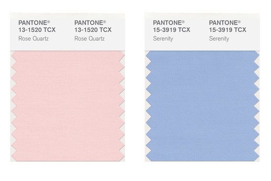
Without the need for explanation, we live in turbulent times. Rose Quartz and Serenity, Pantone says, psychologically fulfill our yearning for a sense of order, peace and security.The two colors convey a connected sense of gentleness, well-being, and mindfulness.
Pantone also cites the color duo challenges the notion of conventional gender association – a “gender blur” that veers towards gender equality and malleability versus segregation.
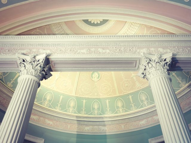
If the thought of using light pink and blue in your home in other than a bedroom seems off-kilter, you might be surprised. The pair is more common than you think – and even historic.
For example, take the Neoclassical architect and designer Robert Adam. He chose pastel shades for many of his intricate ceiling and carpet designs, shown above in his 1779 library design of Kenwood House near London.
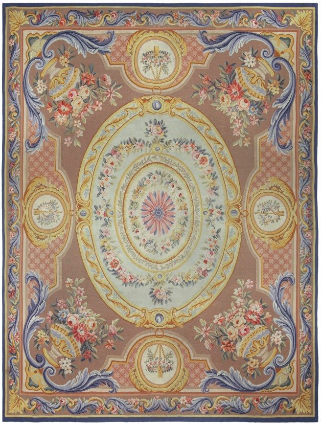
The French embraced these two heavenly hues too, evident in this antique Aubusson. The mocha-colored background tempers the pastels in its palette.
Understandably, uber-historic styles only work for a handful of interiors today. Ever chameleon-like, pink and blue are also at home in countless other décor aesthetics:
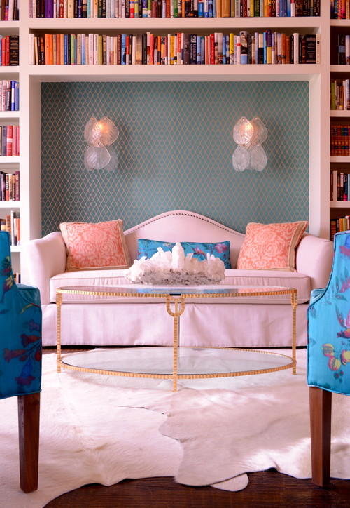
Here, pink and blue create a glammed-up living room design reminiscent of Hollywood’s golden age. On the more vibrant side, a scheme like this would need some neutrals to ground it, like these off-white animal skin area rugs.
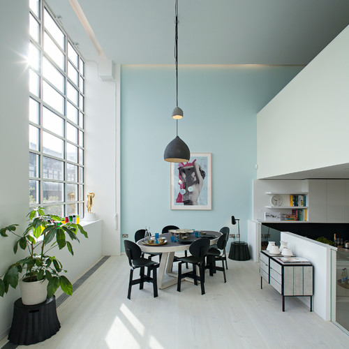
In this contemporary flat in London, pink is used as a secondary accent in the artwork, but it certainly pops. It adds a hint of warmth to this otherwise cool-toned open plan.

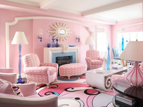

Designer Anthony Baratta fully embraces all pink and blue have to offer in his dynamic design of this New York apartment. Baratta’s whimsical approach is not for the faint of heart.
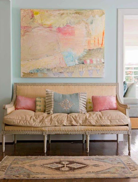
Going full force with 2016’s power palette doesn’t have to bowl you over. A subtle pairing of blue and pink can go a long way. This elegant seating area relies on the color of smaller scale accessories, like throw pillows.
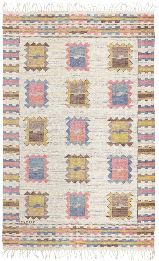
Area rugs, like this handsome geometric Swedish flatweave, add pattern and rhythm to a room. Without being cloyingly sweet or nostalgic, its pink and blue yarns aren’t overly feminine and blend naturally with the earthy brown and ochre colors.
We’ve shown you some great examples how a calming palette of pink and blue can be used in interior spaces outside of the nursery. How do you plan on adding some tranquility to your home this year?
Written by Karen Egly-Thompson
—————————————————————————————————————–
