Q&A with designer Kate Hayes
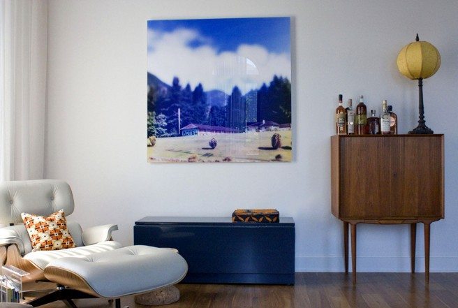
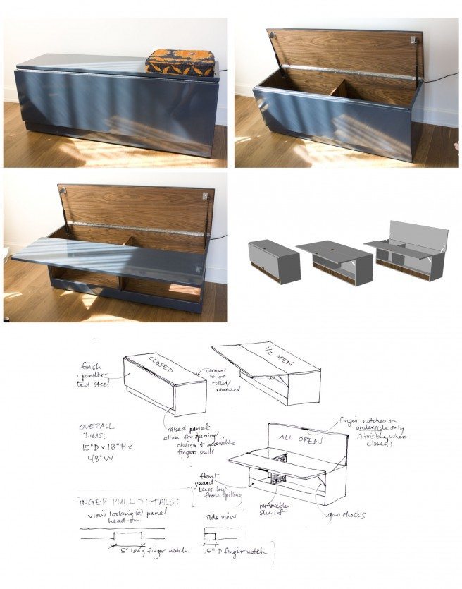
This three-story Chelsea penthouse is home to a couple with two energetic children who love modern and midcentury pieces. The home has gorgeous views of the Empire State building. The main level, pictured here, is the family’s living/dining/playing area. Designer Kate Hayes had to make sure all the pieces could serve multiple purposes. “Most of the casegoods in the space were custom to allow for toy storage but also look chic for company,” she said.
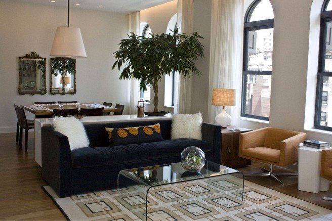
The main level featured one of our midcentury rugs. Kate agreed to chat with us about her design process.
How did you begin?
We started with a few basic pieces: The sofa (originally in a different fabric) and dining table and chairs, all of which were great quality but lacked cohesiveness and personality on their own. The goal was also to keep anything from feeling too ‘done.’
What was your inspiration?
The clients absolutely love orange. We had tackled the bedroom first where we were able to go a bit more luxurious: silk rug, creamy Matteo bedding, glass lamps, a custom built-in and custom wallpaper, because this is the least kid-frequented room in the house. We took the direction from there and toned it down for the living area, with a more subdued palette for the larger, airy common space. So I suppose we were inspired by the color orange, but also by their extensive travels, love of modern, and amazing views of the New York cityscape beyond.
Why this rug?
This rug borders that line of midcentury (almost Hicksian, but less groovy and more urban) and modern, but the grid reflects the intensity of the exterior city buildings, windows and water towers. The view of midtown definitely inspired this direction. Also, the clients love geometrics. It was a perfect fit.
When did the rug enter into the picture?
I like to take a holistic approach to design and really consider all elements at once. We loved the idea of geometric lines with our color scheme, and I sort of fell in love with this rug when I saw it. We brought in the soft orange, steel blue and naturals to keep things toned down. Of course, the rug was the last element to arrive, and the room did not feel nearly as cohesive without it! We designed it together while choosing sofa and chair fabrics as well as the casegoods, tables, lighting and accents throughout the rest of the space. We wanted something with character but that could take a spill.
What are your personal rules on area rug placement?
For more traditional looks, I love an all-encompassing centered rug, with a nice border of hardwood around the room. Along more modern lines, it really depends- I like using a runner as a floating rug in front of a sofa for a chic, minimalist look, or layering irregularly shapes like hides on more traditional rugs for great richness.
What’s your personal aesthetic? I like visually clean and calming. Because I look at fabrics and prints all day, I tend toward bold solid color over prints if I am making a statement. I change things in my own home constantly and find it’s easier not to commit to a print except on smaller items like pillows and small rugs. I love good texture, soft palettes, organic and geometric accents, natural and glam materials mixed like sisal and lucite or cork and nickel. I am constantly evolving and changing as a designer, so I believe in good quality upholstery and case pieces, with the ability to move from eclectic to glam to earthy on a whim.
As I was looking at your portfolio, there seem to be a few themes that carry through your…
I believe in a restful eye, either through repeated movements or themes to create continuity or through natural textures, clean palettes, and crisp, handsome schematics. My style varies greatly from project to project because I very much like to reflect the way my client lives, but I would say a common theme is finding that perfect medium where the client feels both inspired and completely at home, to bring out the best in their taste and elevate that. I do not like having anything feel too overly designed. Relaxation is a key element to achieving true comfort, and feeling like you’d mess something up in your own home is unsettling. To quote Coco Chanel, “Luxury must be comfortable, otherwise it is not luxury.”
About Kate Hayes: Kate is an interior designer based in Brooklyn and Atlanta specializing in residential but with commercial and retail experience assisting on the children’s store Bundle in Soho and also the Palm Jumeirah in Abu Dhabi. See her portfolio here.
About the rug: It was based on a Parkin Saunders design. You can see the rug that served as inspiration here. The original is high and low pile, while the one Kate used is flatweave on a wool background with silk details. You can read more about our designer rugs here.